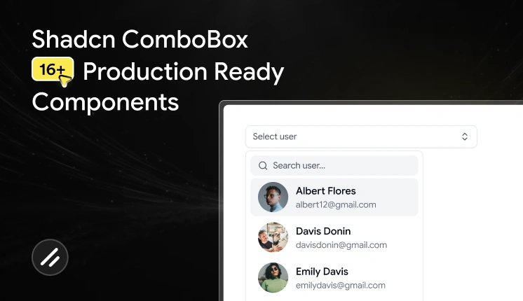
A good combobox can make a big difference in how users interact with your landing page, website or app.
Whether you’re building forms, web pages, dashboards, admin panels, or SaaS products, searchable dropdowns help users find and select options faster while keeping the interface clean and easy to use.
Most developers start with a traditional select component. While it works well for a small number of options, usability often declines as the list grows. Users spend more time scrolling, finding specific items becomes difficult, and forms start to feel less efficient.
That’s where a Shadcn Combobox becomes a better solution.
By combining a input components with a dropdown menu, a combobox helps users find and select options faster while keeping interfaces clean and accessible.
In this collection, you’ll discover some of the Best Shadcn Combobox components for modern React and Next.js applications, including:
- Searchable dropdowns
- Country selectors with flags
- User selection comboboxes
- Multi-select checkbox comboboxes
- Timezone pickers
- Virtualized comboboxes for large datasets
- Linear-inspired combobox patterns
- Advanced filtering interfaces
Whether you’re building a SaaS dashboard, admin panel, onboarding flow, or customer-facing application, these combobox patterns can help improve both usability and efficiency.
Let’s Explore the Best Shadcn Combobox Components
In this blog, we’ll explore 17 real-world Shadcn Combobox examples that demonstrate how searchable dropdowns can improve user experience, simplify complex selections, and create faster workflows in modern web applications.
Basic Combobox
This component provides a simple and familiar way for users to search and select options from a dropdown list. Instead of scrolling through long menus, users can quickly find what they need using the built-in search functionality.
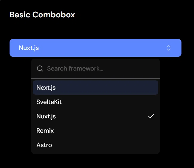
It’s a great starting point for applications that need a clean, lightweight, and easy-to-use selection component.
Key Features
- Searchable dropdown interface
- Fast option filtering
- Keyboard accessible
- Lightweight and easy to customize
- Ideal for forms and settings
Best For: This component is ideal for forms, settings pages, account preferences, dashboard configurations, onboarding flows, and applications that need a simple searchable dropdown without additional complexity.
Popover Combobox
This component displays the dropdown inside a popover, helping keep the interface clean while saving space on the page. Users can search and select options without leaving their current workflow, making interactions feel faster and more organized.
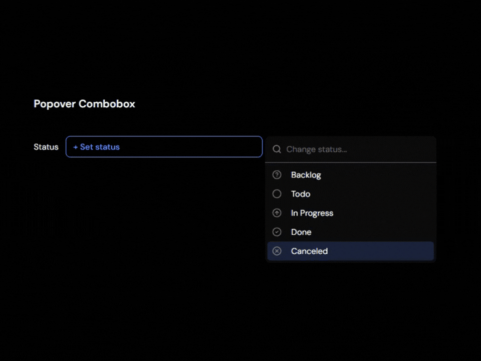
The compact design works especially well in dashboards and applications where screen space is limited.
Key Features
- Popover-based interaction
- Search and filter support
- Compact UI design
- Clear selection feedback
- Works well in dashboards
Best For: This component is ideal for admin dashboards, settings panels, project management tools, data tables, and applications that need a space-efficient selection experience without cluttering the interface.
Dropdown Combobox
This component combines the familiar experience of a traditional dropdown with the speed of searchable options. Users can quickly find and select items without scrolling through long lists, making forms and selection workflows more efficient.
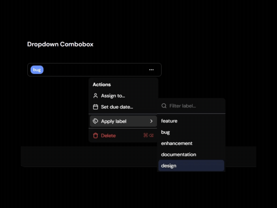
The familiar interface helps users get started immediately while providing a better experience as the number of options grows.
Key Features
- Dropdown-style interface
- Built-in search capability
- Simple and intuitive user experience
- Easy integration into existing forms
- Responsive design support
Best For: This component is ideal for registration forms, settings pages, product selection forms, category pickers, dashboard filters, and applications that need a searchable dropdown with a familiar user experience.
Form Combobox
This component is built for forms where users need to search and select values while maintaining proper validation and accessibility. It integrates smoothly with form workflows, making it easier to collect accurate input without compromising the user experience.
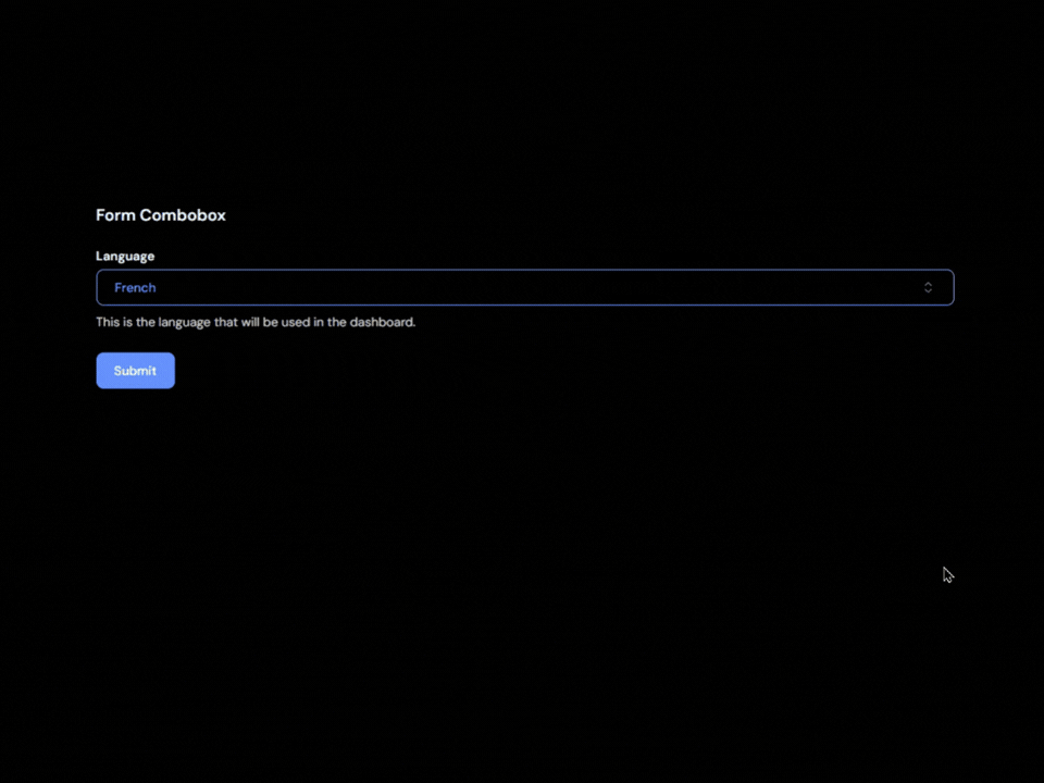
The searchable interface helps users find options faster while ensuring selections work seamlessly with form submission and validation logic.
Key Features
- Form validation support
- Seamless form integration
- Searchable selections
- Accessible form controls
- Works with React Hook Form and similar libraries
Best For: This component is ideal for onboarding forms, profile settings, account preferences, dashboard configurations, registration forms, and data entry applications where selections need to be validated and submitted alongside other form fields.
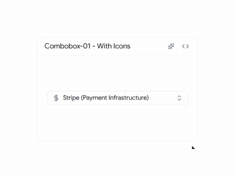
Combobox with Icons
A combobox with icons helps users identify options faster by adding visual context alongside text labels. Instead of scanning through a list of names, users can quickly recognize technologies, tools, categories, or products at a glance.
Key Features
- Icons displayed inside dropdown options
- Faster option discovery
- Searchable and accessible interface
- Fully customizable with Tailwind CSS
- Works seamlessly with React and Next.js
Best for: This component is ideal for technology selectors, product categories, dashboard settings, and platform switchers where visual recognition can help users make faster decisions.
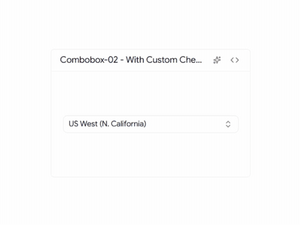
Custom Country Check Icon Combobox
This country picker designed with custom selection indicators that provide clearer visual feedback than traditional checkmarks. The enhanced selection state makes it easier for users to verify their choice while maintaining a clean and modern interface.
Key Features
- Custom selected-state icon
- Searchable country list
- Clear visual confirmation
- Mobile-friendly interaction
- Tailwind CSS customization support
Best for: This component is ideal for registration forms, onboarding flows, billing systems, and international applications where users need to select their country quickly and confidently.
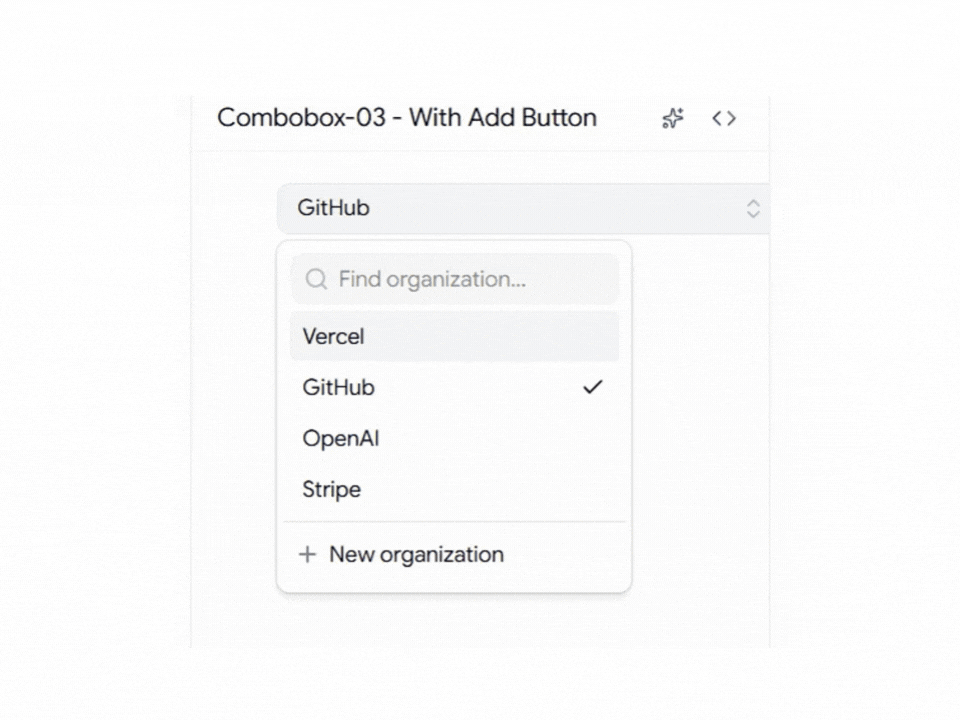
Combobox with Add Button
This combobox combines option selection with item creation, allowing users to add new entries directly from the dropdown interface. Instead of leaving the current workflow to create a new item, users can search, select, and add options from a single component.
Key Features
- Built-in add action
- Quick item creation
- Search and selection support
- Reduced form friction
- Improved workflow efficiency
Best For: This component is ideal for tag management systems, CRM applications, project management tools, category creation workflows, and dynamic forms where users frequently need to create new options while making a selection.
Timezone Combobox
Selecting a timezone can be challenging when hundreds of options are available. This combobox simplifies the experience with searchable timezone data, making it easier for users to find the correct timezone without scrolling through long lists.
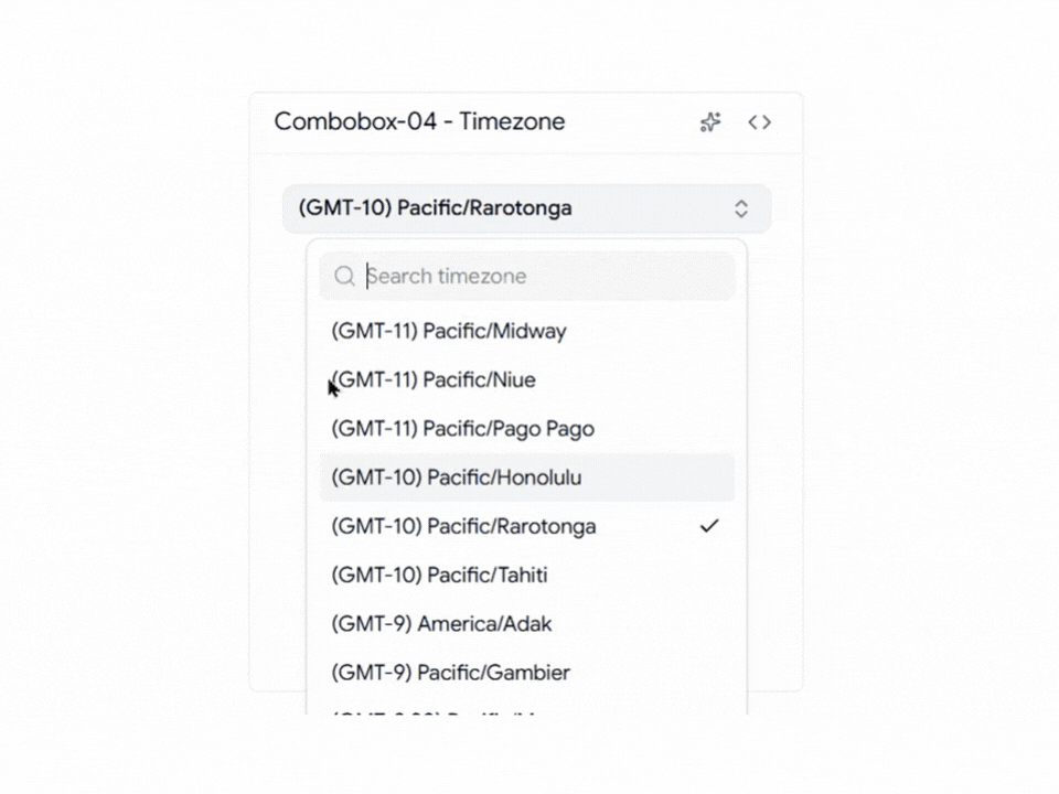
It’s a practical component for applications that support users across multiple regions and time zones, helping reduce errors during scheduling and account setup.
Key Features
- Searchable timezone database
- Fast filtering
- Global timezone coverage
- User-friendly selection experience
- Optimized for large option sets
Best For: This component is ideal for SaaS applications, scheduling platforms, booking systems, video conferencing tools, meeting management software, and remote team applications where accurate timezone selection is essential for delivering a seamless user experience.
User Selection Combobox
The User Selection Combobox helps users quickly find and select team members from a list. By showing avatars and names together, it becomes easier to identify the right person, especially in teams with many members.
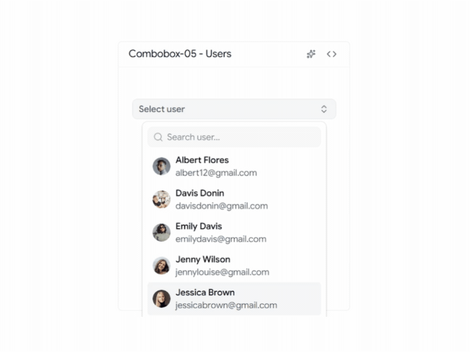
This component is commonly used in dashboards and team management applications where users need to assign tasks, projects, roles, or permissions.
Key Features
- Avatar support
- User profile display
- Searchable member list
- Clear selected states
- Works well with large teams
Best For: This component is ideal for project management tools, team collaboration platforms, admin dashboards, task assignment systems, and employee management applications where users need to search and select team members quickly.
Country Combobox with Flags
This Country Combobox with Flags makes country selection faster and easier by displaying flags alongside country names. Users can quickly recognize their country without having to read through a long list of options.
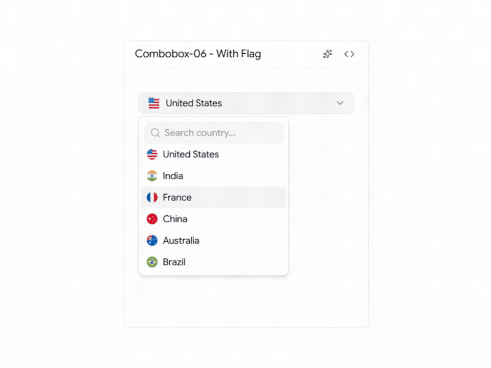
This component helps create a smoother experience in forms where country selection is an important step.
Key Features
- Country flag support
- Searchable country list
- Fast country lookup
- Clean dropdown layout
- Improved user experience
Best For: This component is ideal for signup forms, user profile pages, shipping forms, billing forms, and international SaaS applications where users need to select their country quickly and accurately.
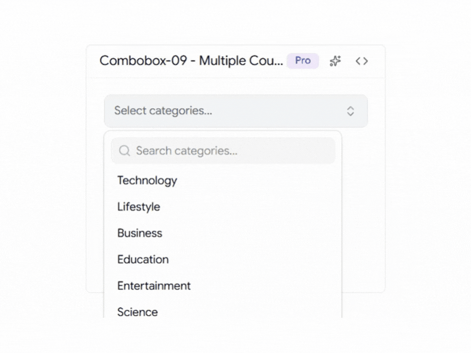
Multiple Selection Combobox
This component allows users to select multiple options from a single dropdown without making the interface feel crowded. Users can search, filter, and choose several items quickly while keeping selections organized and easy to manage.
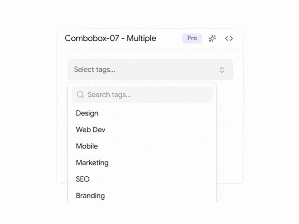
It helps simplify multi-select workflows and provides a better experience than traditional multi-select fields.
Key Features
- Multi-select checkbox interface
- Search and filter support
- Clear selected state indicators
- Keyboard accessible navigation
- Works well with large datasets
Best For: This component is ideal for user role management, product filters, category selection, tag management systems, and applications where users need to select multiple items from a large list.
Multiple Expandable Combobox
This component organizes options into expandable groups, making large lists easier to browse and manage. Users can expand only the sections they need, helping them find options faster without scrolling through a long dropdown.
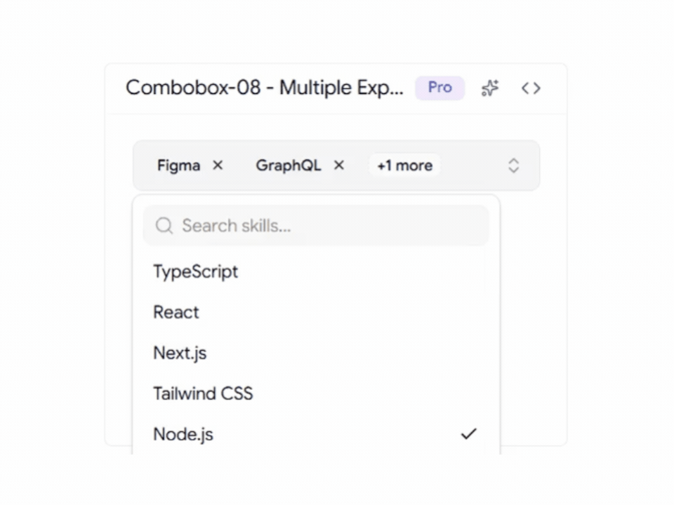
It keeps the interface clean while improving navigation for complex selection workflows.
Key Features
- Expandable option groups
- Nested checkbox selection
- Better organization for large option sets
- Improved discoverability
- Mobile-friendly interaction
Best For: This component is ideal for settings pages, permission management systems, advanced filtering interfaces, and applications that need to organize large numbers of options into categories.
Multiple Count Badge Combobox
This component displays the number of selected items inside the combobox trigger, making it easy for users to understand their selections without displaying a long list of values.
It helps keep forms and dashboards clean while still providing clear feedback during the selection process.
Key Features
- Dynamic selection count badge
- Compact trigger design
- Supports large multi-select lists
- Clear visual feedback
- Optimized for dashboard interfaces
Best For: This component is ideal for analytics dashboards, reporting tools, customer segmentation platforms, project management applications, and any interface where users frequently select multiple options.
Virtualized Shadcn Combobox
This component is designed for applications that need to handle large datasets efficiently. By using virtualization, it only renders the visible options instead of loading the entire list at once, helping maintain smooth performance even when thousands of records are available.
It provides a faster and more responsive experience for users working with data-heavy applications.
Key Features
- Virtualized rendering
- Smooth scrolling experience
- Handles massive datasets
- Reduced memory usage
- High-performance filtering
Best For: This component is ideal for enterprise dashboards, analytics platforms, internal business tools, data management systems, and applications that need to display large amounts of searchable data without performance issues.
Downshift Selection Combobox
This component allows users to select multiple options while providing advanced keyboard navigation and accessibility support. It combines powerful filtering capabilities with checkbox-based selection, making it easier to manage complex selection workflows.
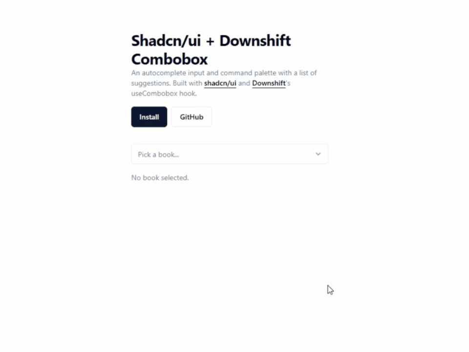
The flexible structure makes it suitable for applications that require more control than a standard combobox.
Key Features
- Checkbox multi-selection
- Accessible keyboard controls
- Advanced filtering support
- Flexible customization
- Supports complex selection workflows
Best For: This component is ideal for reporting filters, search refinement panels, settings pages, analytics tools, and applications where users need to select and manage multiple options efficiently.
Shadcn Linear Combobox
This component is inspired by Linear’s clean and minimal design approach. It focuses on fast interactions, clear visual hierarchy, and a distraction-free user experience that feels modern and responsive.
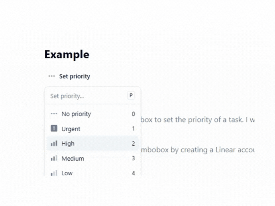
The streamlined interface helps users make selections quickly while maintaining a polished look across the application.
Key Features
- Linear-inspired UI
- Minimal visual design
- Fast interaction patterns
- Priority and status selection
- Optimized user experience
Best For: This component is ideal for task management applications, productivity tools, issue tracking systems, project management platforms, and modern SaaS dashboards that prioritize speed and simplicity.
Async Combobox
This component loads options dynamically as users type, making it a great choice for applications that work with large datasets or API-driven data. Instead of loading all options upfront, it fetches only the relevant results, helping keep the interface fast and responsive.
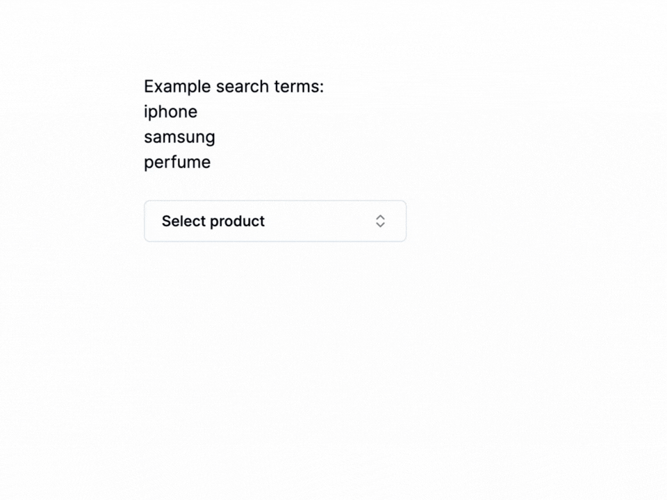
The built-in search experience includes debounced requests, loading states, and empty state handling, creating a smoother experience when working with remote data sources.
Key Features
- Async data fetching
- Debounced search input
- Loading and error states
- Dynamic search results
- Optimized for API-driven applications
Best For: This component is ideal for product search, customer lookup, user directories, inventory management systems, CRM platforms, and applications that need to fetch and display data from APIs without loading large datasets into the browser.
Final Thoughts
All Shadcn Combobox components featured in this collection cover a wide range of use cases, from simple dropdowns and country selectors to advanced multi-select and virtualized comboboxes.
Since they are fully customizable, you can easily adapt them to match your application’s design and workflow requirements.
Looking beyond combobox components ?
Explore our Shadcn Dashboard Templates, which come with many of these components already integrated, helping you build modern web applications faster without starting from scratch.
Need more Shadcn Components for your next project ?
Check out our collection of Shadcn Components, including forms, navigation elements, data display components, feedback systems, and other essentials for creating production-ready applications.
Planning to use a combobox inside a form ?
Don’t miss our 15 Shadcn Forms , where you’ll find practical form layouts and real-world implementations that work perfectly with these combobox components.
With the right components in the app, building intuitive and user-friendly React and Next.js applications becomes much easier.