
When building a React application, developers often repeat the same UI work. Buttons, forms, cards, dashboards, charts, and loaders – most of these components already follow common patterns.
The real challenge is not building them. The challenge is to build them fast, keep them customizable, and avoid heavy UI dependencies. This is where the shadcn component ecosystem became popular among developers.
Instead of installing a UI library that controls your styling and architecture, these components follow a copy-paste architecture. Developers add the component directly to their project and modify the source code as needed.
This approach works well for teams that want:
- full control over the component code
- predictable accessibility behavior
- Tailwind-first styling
- flexible design systems
Developer Implementation Checklist
Before integrating these components into a project:
| Checklist Stage | Items to Verify / Implement |
| Developer Implementation | – React v18 or Next.js project – TypeScript enabled – Tailwind CSS configured – CLI initialized – Connect to the API or the state – Test keyboard accessibility |
| Production Validation | – Verify responsive layout – Test animation performance – Optimize bundle size |
What are Shadcn Components?
Shadcn components are a set of reusable React UI components that developers add directly into their project code rather than installing them as a traditional UI library dependency. This copy‑paste model gives you full ownership of the component source, allowing you to customize the structure, styles, and logic freely.
- They are built with React and styled using Tailwind CSS, often using Radix UI or Base UI primitives for accessible interactions.
- This means no heavy external UI frameworks controlling your design or architecture.
The main advantages of this approach include:
- Full code control
- Tailwind‑first styling
- Predictable accessibility
- Easy customization without waiting for library updates
Installing components using CLI
Developers usually install these components using a CLI command.
The CLI can be executed with pnpm, npm, yarn, or bun, depending on the project’s package manager.
Initialize the project:
pnpm dlx shadcn@latest initThis command configures project dependencies and sets up utilities and CSS variables required by the components.
You can also run the same command using different package managers:
npx shadcn@latest init
yarn dlx shadcn@latest init
bunx shadcn@latest init
For more information and clarity, visit our official get-started guide for the CLI.
Add a component
Once the project is initialized, developers can install a specific component using:
pnpm dlx shadcn@latest add buttonThe CLI automatically:
- installs required dependencies
- creates the component files
- places them inside the project structure
This works the same way with other package managers:
npx shadcn@latest add button
yarn dlx shadcn@latest add button
bunx shadcn@latest add button
Developers can also install multiple components or all available components using CLI commands.
Tech stack used across most components
Most components in this ecosystem follow a consistent frontend architecture.
| Layer | Technology |
| UI Framework | React/Next.js |
| Language | TypeScript |
| Styling | Tailwind CSS |
| Accessibility | Base UI / Radix UI |
| Animations | CSS or Motion libraries |
This stack keeps components lightweight and easy to integrate into existing React projects.
Top Shadcn UI Components for Modern Applications
Explore a curated set of 50+ practical, production‑ready UI components that power modern dashboards, tools, and interfaces.
Marquee
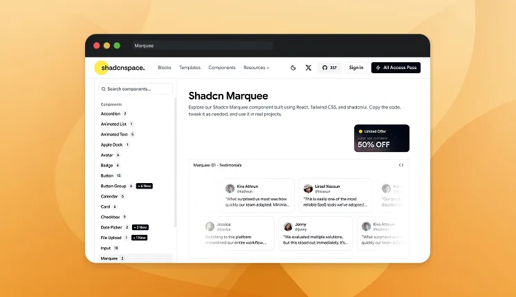
A Marquee component renders continuously scrolling content across the screen, typically used for logos, announcements, or feature highlights. It creates a smooth infinite loop animation that keeps content moving without user interaction. Developers can control scroll direction, speed, and pause-on-hover behavior using simple React logic and Tailwind utilities. It’s lightweight and ideal for adding motion to otherwise static sections.
Variations: 2
Use cases
- Display partner or client logos
- Scrolling announcements or updates
- Product feature highlights
- Testimonials carousel alternative
- Tech stack showcase
Best for: Continuously displaying repeated content in a compact animated section.
Animated Text
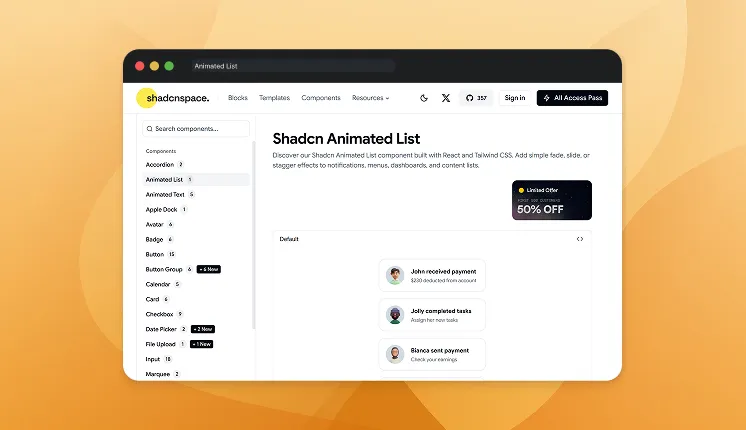
Animated Text enhances typography by adding motion effects like typing, shimmer, gradient, or rolling animations. It helps developers emphasize headings, highlight calls-to-action, or create engaging hero sections. The component supports letter-level or word-level animation control and integrates smoothly with React rendering cycles. It’s designed to keep animation lightweight while maintaining accessibility.
Variations: 5
Use cases
- Hero section headlines
- Interactive landing page slogans
- Loading or system messages
- Feature highlights
- Animated call-to-action text
Best for: Creating dynamic headings and attention-grabbing typography.
Form Wizard
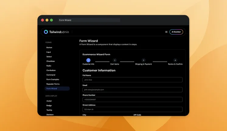
Form Wizard divides complex forms into multiple sequential steps. This improves usability when collecting large amounts of data. Developers can validate each step independently before proceeding. The result is a smoother user experience.
Variations: 1
Use cases
- Onboarding flows
- Registration processes
- Checkout steps
- Multi-step surveys
- Application forms
Best for: Handling large forms in structured steps.
Calendar
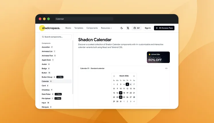
The Calendar component provides a fully interactive date selection interface for modern web applications. Developers can implement single date selection, multiple selections, or date range pickers. It integrates seamlessly with form handling and state management. Accessibility and keyboard navigation are supported by default.
Variations: 4
Use cases
- Booking systems
- Event scheduling
- Project timelines
- Date filtering in dashboards
- Reservation forms
Best for: Applications that require structured date input and scheduling workflows.
Apple Dock
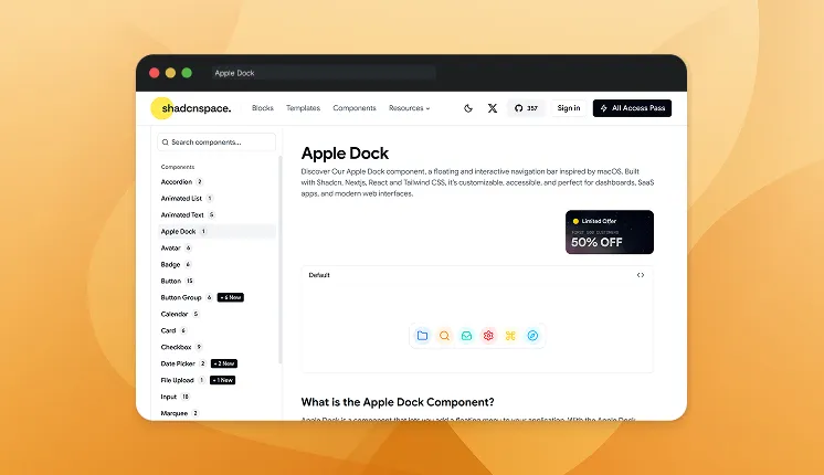
Apple Dock replicates the interactive dock effect seen in macOS, where icons scale when hovered. It provides a visually engaging way to display actions or navigation items. Built using smooth hover animations, it improves discoverability while maintaining a clean UI layout. Developers often use it for product demos or portfolio sites.
Variations: 1
Use cases
- Portfolio navigation
- Interactive feature navigation
- Product showcase menus
- Developer tool launchers
- Creative landing pages
Best for: Building highly interactive icon-based navigation.
Progressbar
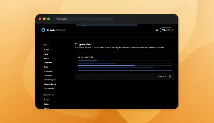
A progress bar visually represents the completion state of a task or process. It helps users understand how much work remains. Developers commonly use it in file uploads, onboarding, or background processes.
Variations: 3
Use cases
- Upload progress
- Onboarding progress
- Installation steps
- Background processing
- Task completion tracking
Best for: Visualizing task completion.
Animated List
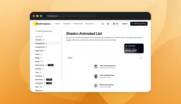
Animated List allows list items to appear sequentially with motion effects like fade, slide, or staggered transitions. This improves perceived performance and readability when displaying dynamic data. Instead of rendering everything instantly, the UI progressively reveals content. The result is a smoother and more polished user experience.
Variations: 1
Use cases
- Notification feeds
- Chat messages
- Activity timelines
- Dashboard updates
- Onboarding checklists
Best for: Progressively rendering dynamic lists in dashboards and feeds.
Breadcrumb
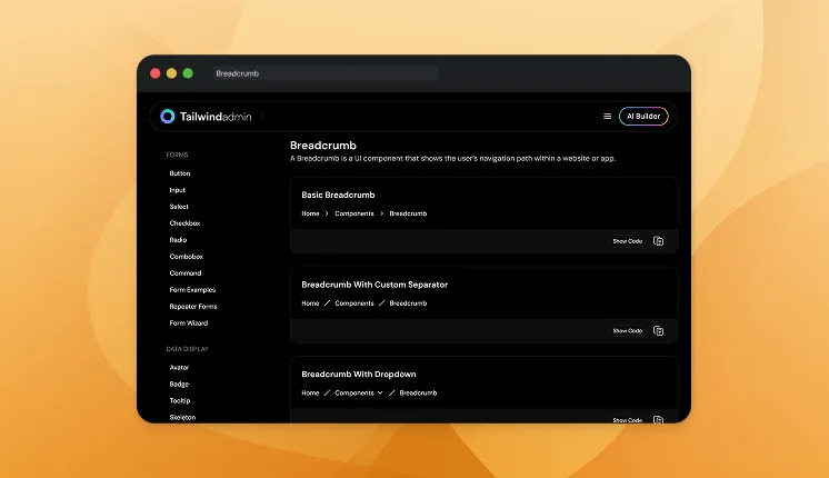
Breadcrumb navigation displays the hierarchical path to the current page. It improves navigation clarity in large applications. Developers often use breadcrumbs in dashboards and documentation sites.
Variations: 2
Use cases
- Documentation navigation
- Admin dashboards
- E-commerce category pages
- CMS interfaces
- File management systems
Best for: Showing navigation hierarchy.
Orbiting Circles
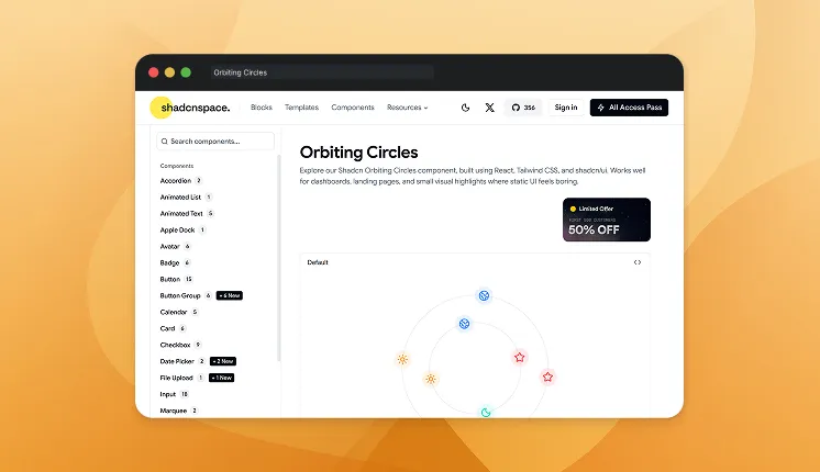
Orbiting Circles create a circular animation where elements revolve around a central point. Each circle can contain icons, images, or text representing connected entities. The animation runs automatically, giving the interface a dynamic feel without requiring interaction. It is often used to visually represent relationships between features or technologies.
Variations: 1
Use cases
- Product ecosystem visualization
- Technology stack display
- Feature highlight sections
- Portfolio skill visualization
- Landing page animations
Best for: Visually representing connected items around a central concept.
Badge
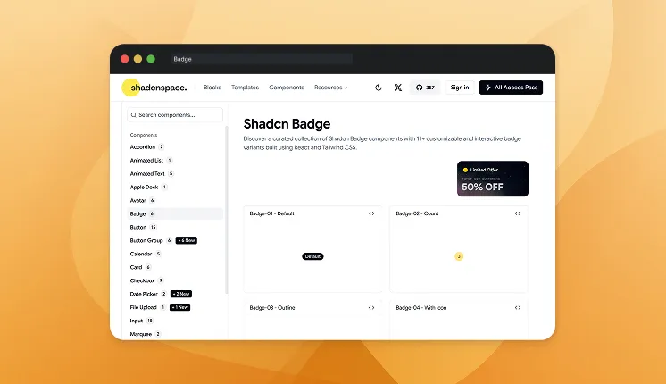
Badge components display small visual indicators attached to other UI elements. They typically highlight status, counts, or category labels. Developers can style them using different color variants to represent success, warnings, or informational states. Badges are lightweight but highly effective for metadata visualization.
Variations: 6
Use cases
- Notification counters
- Status indicators
- Tags or labels
- Feature flags
- User roles
Best for: Displaying compact metadata attached to interface elements.
Skeleton
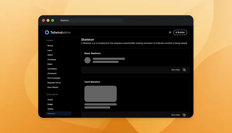
Skeleton components show placeholder UI elements while content is loading. They improve perceived performance by mimicking the final layout. Developers use them instead of spinners to reduce layout shift.
Variations: 3
Use cases
- API loading states
- Dashboard initialization
- Feed loading placeholders
- Content preloading
- Profile page loading
Best for: Improving perceived loading performance.
Button
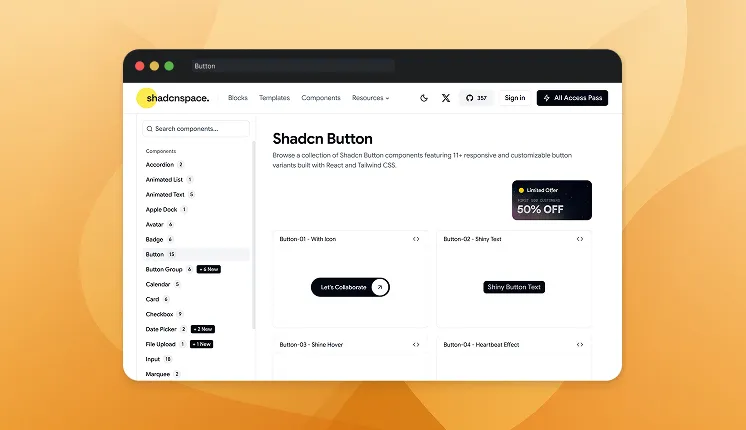
Buttons trigger user actions such as submitting forms, navigating pages, or launching dialogs. They are one of the most frequently used UI primitives in any application. Developers can create multiple variants like primary, secondary, outline, or icon buttons. Proper accessibility attributes ensure keyboard and screen-reader support.
Variations: 15
Use cases
- Form submission
- Modal triggers
- Navigation actions
- API request triggers
- Dashboard controls
Best for: Triggering core interactions across the interface.
Input
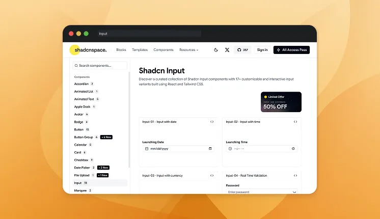
Input components capture structured user data in forms and search fields. They support validation states, placeholders, and controlled input behavior. Developers can integrate them with form libraries for real-time validation. The component is optimized for accessibility and responsive design.
Variations: 18
Use cases
- Login forms
- Search fields
- Profile editing
- Configuration settings
- Data filtering
Best for: Collecting text-based user input in applications.
Pie Chart
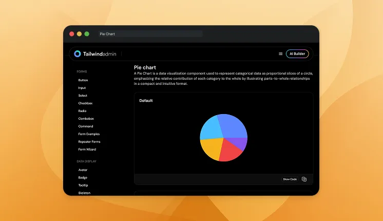
Pie Chart components visualize proportional data using circular segments. They are widely used in analytics dashboards. Developers can dynamically render datasets and update charts in real time.
Variations: 2
Use cases
- Sales distribution
- User demographics
- Traffic sources
- Revenue analytics
- Performance metrics
Best for: Visualizing percentage-based datasets.
File Upload
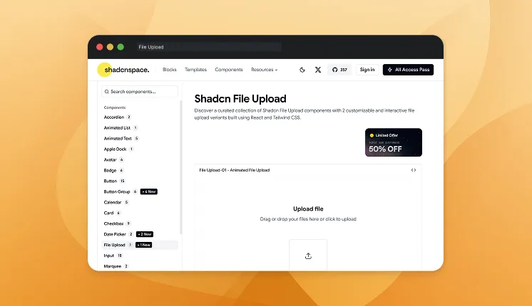
File Upload components allow users to select, drag, or drop files into an application. They typically include preview states, upload progress, and validation logic. Developers can connect them with cloud storage APIs or backend upload services. The component improves usability for document-heavy workflows.
Variations: 2
Use cases
- Document uploads
- Image galleries
- Profile photo updates
- Dataset imports
- Resume submissions
Best for: Handling file selection and uploads within forms.
Avatar
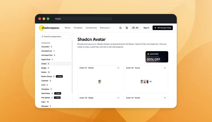
Avatar components visually represent users using profile images or initials. They support fallback states when images fail to load. Developers can also group avatars to represent teams or shared activities. The component integrates easily with comment systems and collaboration features.
Variations: 6
Use cases
- User profile images
- Chat participants
- Team member lists
- Collaboration apps
- Activity feeds
Best for: Representing users visually across the interface.
Repeater Forms
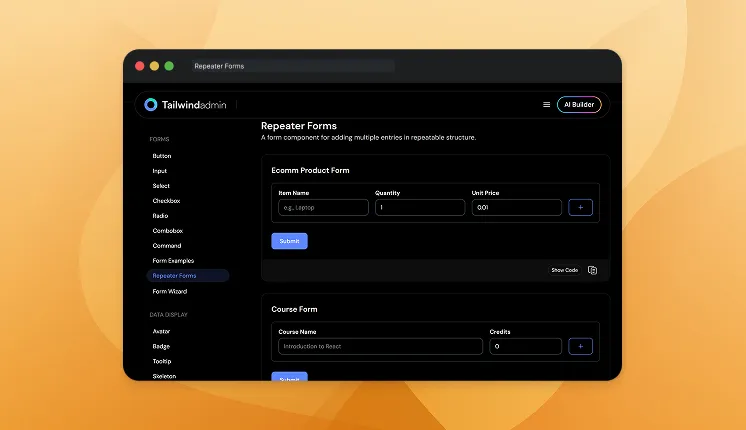
Repeater Forms allow users to dynamically add or remove repeating form sections. Developers use them for forms where multiple entries are expected. Each repeated section maintains its own state and validation.
Variations: 1
Use cases
- Adding multiple addresses
- Invoice item lists
- Dynamic survey responses
- Project task entries
- Team member forms
Best for: Dynamic multi-entry form workflows.
Tabs
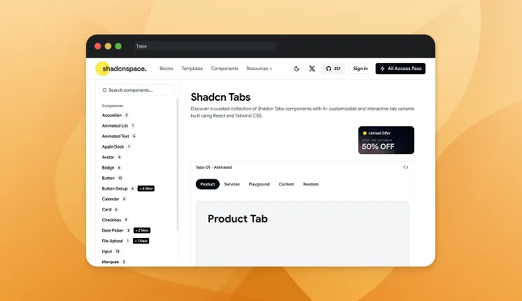
Tabs organize related content into multiple panels without navigating away from the current page. They improve UI clarity by splitting complex interfaces into smaller sections. Developers can include icons, counters, or animations to enhance interaction. Keyboard navigation ensures accessibility compliance.
Variations: 4
Use cases
- Dashboard sections
- Account settings
- Documentation pages
- Analytics dashboards
- Feature configuration panels
Best for: Switching between multiple views within the same page.
Accordion
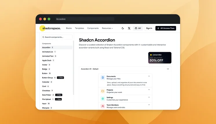
Accordion components collapse and expand content panels to reduce clutter in long pages. They are commonly used for FAQs, documentation sections, or configuration settings. Each section can be toggled independently. Developers benefit from clean state management and accessible keyboard navigation.
Variations: 2
Use cases
- FAQ sections
- Documentation navigation
- Settings panels
- Onboarding instructions
- Product specifications
Best for: Progressively revealing structured content.
Shine Border
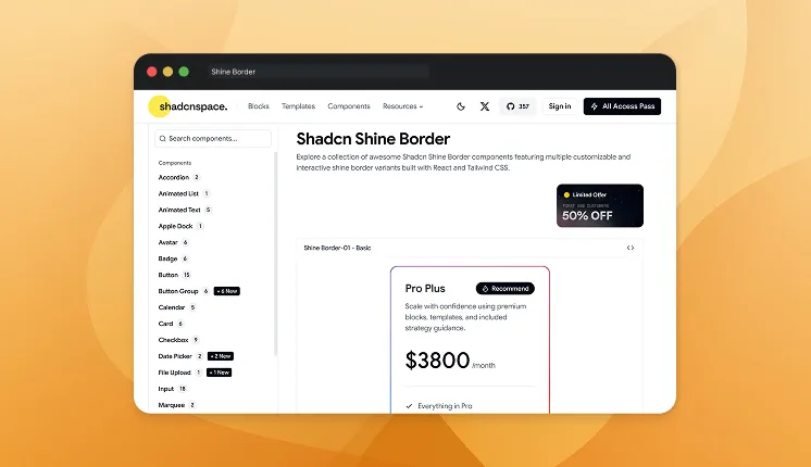
Shine Border adds a subtle animated highlight around UI elements like cards or buttons. The animation simulates a moving light reflection along the border. This effect draws user attention without overwhelming the design. Developers often combine it with feature cards or pricing blocks.
Variations: 1
Use cases
- Feature highlights
- Pricing card
- Call-to-action buttons
- Premium feature sections
- Product cards
Best for: Visually emphasizing important UI elements.
Number Ticker
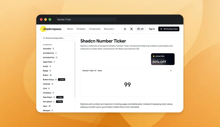
Number Ticker animates numeric values as they increment toward a target number. It creates engaging transitions for statistics or metrics. Developers can control animation speed and formatting for currencies or percentages. This component is frequently used in analytics dashboards.
Variations: 1
Use cases
- Analytics dashboards
- KPI metrics
- User counters
- Revenue displays
- Statistics sections
Best for: Animating numeric metrics and statistics.
Checkbox
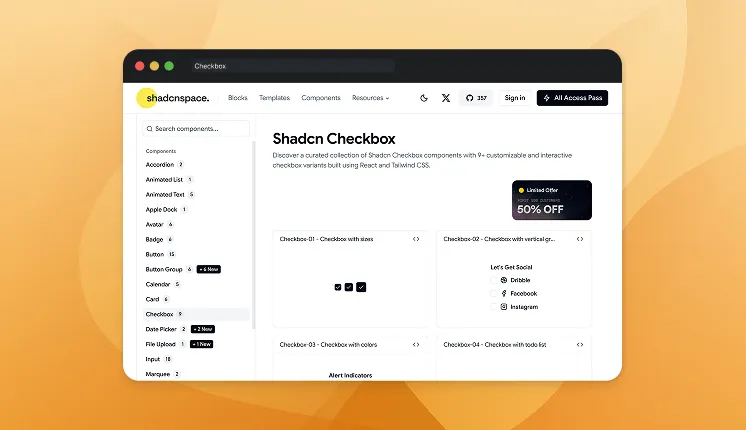
Checkbox components allow users to select multiple options from a list. They support checked, unchecked, and indeterminate states. Developers can integrate them into forms, filters, or permission management systems. Keyboard navigation ensures accessibility.
Variations: 3
Use cases
- Task lists
- Permission management
- Feature toggles
- Filter selections
- Form inputs
Best for: Enabling multi-selection input.
Date Picker
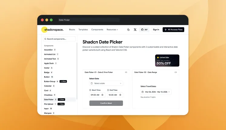
Date Picker combines a calendar interface with input fields for selecting dates easily. Developers can configure single date, multiple dates, or range selections. It integrates with booking workflows and event scheduling. The component ensures accurate date input for complex forms.
Variations: 2
Use cases
- Booking platforms
- Travel reservations
- Appointment scheduling
- Reporting filters
- Project deadlines
Best for: Selecting dates in form workflows.
Card

Card components act as containers for grouping related content and actions. They typically include headers, descriptions, and action buttons. Developers use cards to build modular layouts in dashboards or product listings. Their flexible structure makes them suitable for responsive UI designs.
Variations: 6
Use cases
- Product listings
- Dashboard widgets
- Blog previews
- User profiles
- Feature highlights
Best for: Creating modular content blocks.
Tooltip
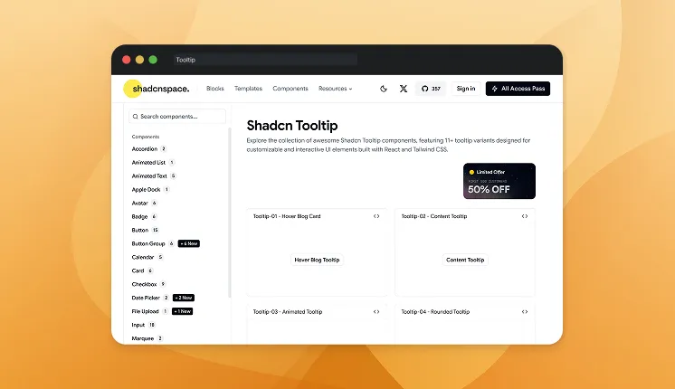
Tooltips display contextual information when users hover or focus on an element. They provide additional explanations without cluttering the UI. Developers can attach them to icons, buttons, or inputs. The component supports accessibility and keyboard interactions.
Variations: 7
Use cases
- Icon explanations
- Form guidance
- Feature descriptions
- Button hints
- Shortcut instructions
Best for: Showing contextual help without interrupting the workflow.
Spinning Text
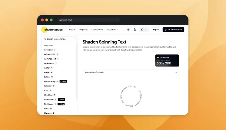
Spinning Text displays text rotating along a circular path. This animation style is often used in creative hero sections or branding elements. Developers can customize rotation speed, direction, and typography. It adds a dynamic visual element to otherwise static layouts.
Variations: 1
Use cases
- Landing page decoration
- Brand slogans
- Hero animations
- Marketing banners
- Portfolio design elements
Best for: Decorative animated typography.
Button Group
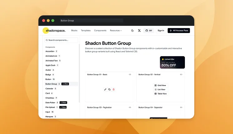
Button Group organizes multiple related actions into a single grouped UI element. This improves layout consistency and avoids scattered controls. Developers can combine primary actions, toggles, or segmented controls. It is particularly useful in toolbars or filtering systems.
Variations: 2
Use cases
- Filter selections
- Toolbar controls
- Segmented navigation
- Formatting tools
- Dashboard actions
Best for: Grouping related actions in a compact layout.
Select
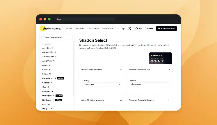
Select components allow users to choose a single option from a dropdown menu. They are commonly used in forms and configuration settings. Developers can enable search, custom options, or grouped selections. Accessibility and keyboard navigation are built in.
Variations: 4
Use cases
- Country selection
- Category filters
- Language selection
- Configuration settings
- Dataset filters
Best for: selecting a single option from predefined lists.
Textarea
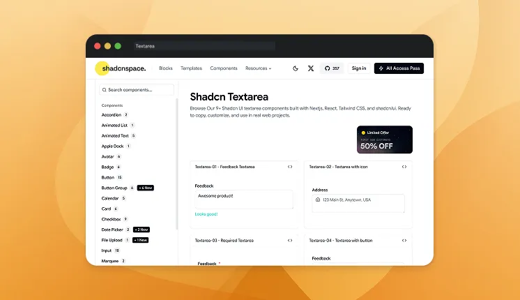
Textarea components allow users to input multi-line text content. They are commonly used in feedback forms, comments, or messaging systems. Developers can add auto-resize behavior or validation rules. The component integrates easily with form libraries.
Variations: 2
Use cases
- Feedback forms
- Support tickets
- Comment sections
- Messaging systems
- Description fields
Best for: Capturing longer text input.
Switch
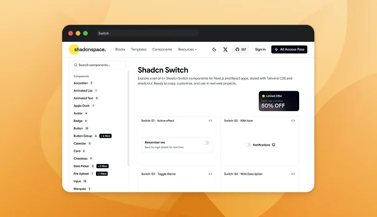
Switch components provide a toggle interface for enabling or disabling settings. They offer clearer interaction than traditional checkboxes for binary states. Developers commonly use them in preference panels or feature toggles.
Variations: 2
Use cases
- Dark mode toggles
- Feature enable/disable
- Privacy settings
- Notification preferences
- System configuration
Best for: Toggling binary settings.
Alert
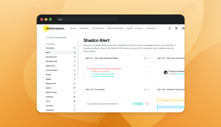
Silent failures train users to ignore your app. Alert components surface status, warnings, errors, and success states inside a contained block that fits the surrounding layout. You control the variant, icon, title, and description so the severity reads at a glance. The result is a message that gets noticed without breaking the user’s flow.
Variations: 6
Use cases
- Form validation errors
- Success confirmations after an action
- System or maintenance warnings
- Inline notices inside dashboards
- API or connection failure messages
Best for: Communicating status clearly without interrupting the workflow.
Autocomplete
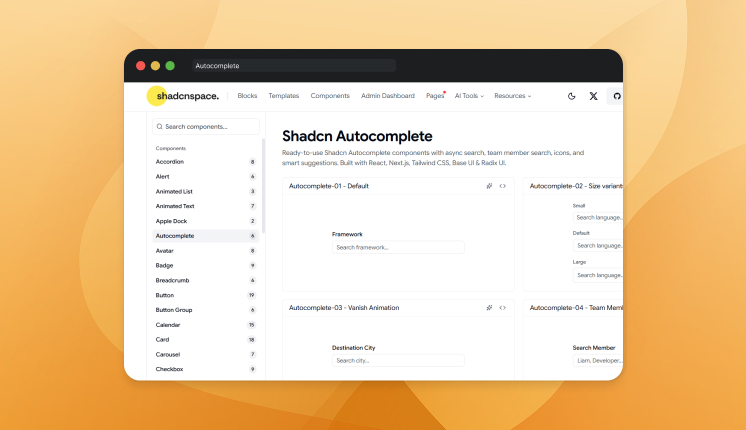
A long static dropdown forces users to hunt for the option they already know. Autocomplete filters results as the user types, narrowing a large list down to a few relevant matches. You can wire it to a local array or an async API call with debounced queries. That turns a slow scroll into a two-keystroke selection.
Variations: 6
Use cases
- Search bars with live suggestions
- Address or location fields
- Tag and category selection
- Product or user lookup
- Filtering large datasets quickly
Best for: Speeding up input when users pick from many possible values.
Carousel
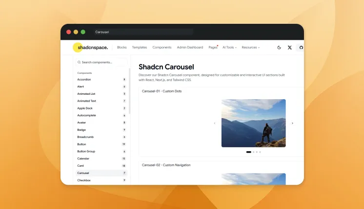
Carousels look simple until you handle swipe gestures, keyboard navigation, and autoplay in the same component. This one manages slide transitions, touch support, and looping with minimal setup. You control orientation, slide count, and navigation arrows through props. Accessibility and focus handling stay intact while users move through content.
Variations: 7
Use cases
- Image and product galleries
- Testimonial sliders
- Featured content rotation
- Onboarding screens
- Step-by-step walkthroughs
Best for: Displaying sequential content in a compact, swipeable space.
Code Block
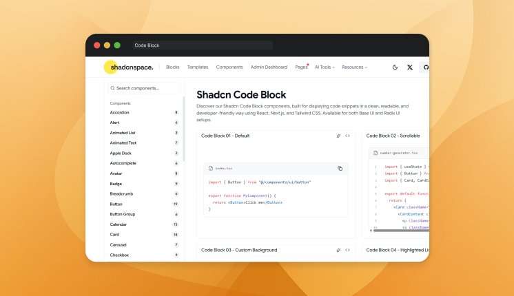
Pasting raw code into a plain div breaks indentation and kills readability. Code Block renders syntax-highlighted snippets with proper spacing, language tabs, and a copy-to-clipboard button. You can set the language, highlight specific lines, and show multiple files inside tabs. That keeps tutorials and documentation easy to read and copy.
Variations: 7
Use cases
- API documentation
- Developer tutorials
- Technical blog posts
- Installation command snippets
- Multi-file code examples
Best for: Displaying readable, copyable code inside docs and guides.
Collapsible
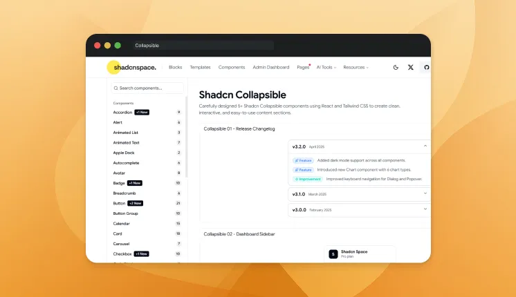
Building a collapsible UI sounds simple until you handle nested layouts, animation states, and keyboard accessibility together. Collapsible expands and hides content with smooth height transitions and correct focus handling. You control the open state, default behavior, and trigger without rewriting custom toggle logic. That saves you from rebuilding the same accordion pattern for every panel.
Variations: 5
Use cases
- Settings panels
- Sidebar navigation groups
- FAQ sections
- Expandable table rows
- Showing or hiding advanced options
Best for: Hiding secondary content until the user needs it.
Combobox
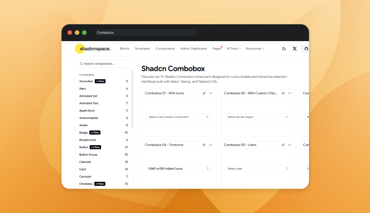
Native select elements fall apart once you need search, async loading, and custom option rendering. A combobox pairs a text input with a dropdown list so users type to filter and then pick a value. You get keyboard navigation, controlled state, and async support without stitching them together yourself. That is why developers reach for it over a styled select.
Variations: 9
Use cases
- Searchable dropdowns
- Framework or option pickers
- Country and currency selection
- Assigning users or labels
- Filtering long option lists
Best for: Selecting one value from a large, searchable set.
Command
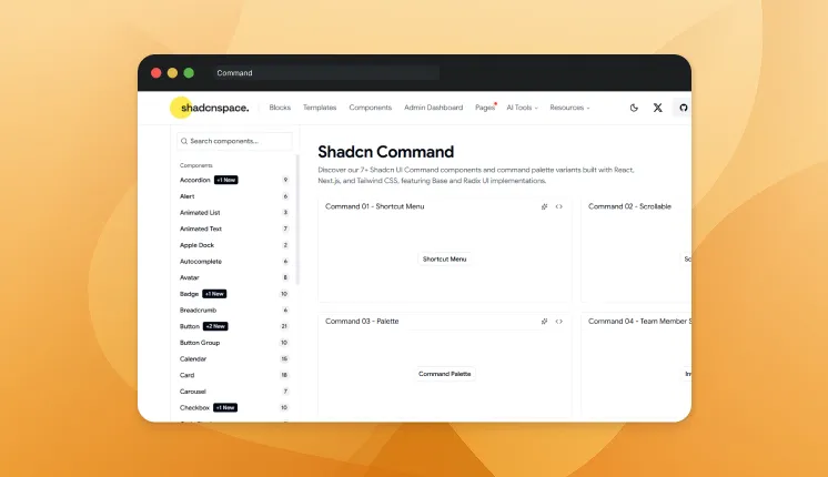
Power users navigate by keyboard, not by hunting through menus. Command renders a searchable palette that lets users trigger actions and jump between pages instantly. You register commands, groups, and shortcuts, and the built-in fuzzy search handles matching. The result is fast access to anything in your app from a single shortcut.
Variations: 7
Use cases
- Command palette (Cmd+K)
- Quick navigation menus
- Action launchers in dashboards
- Search-driven workflows
- Keyboard-first interfaces
Best for: Giving users fast keyboard access to actions and navigation.
Context Menu
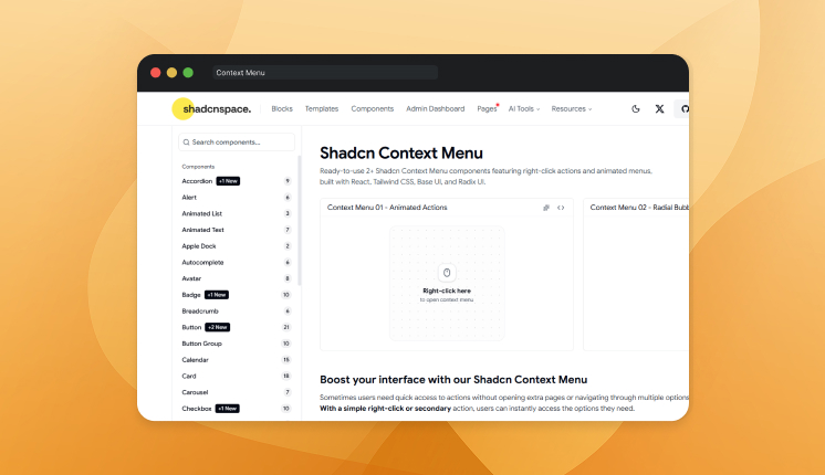
Right-click menus on the web are easy to ignore and easy to build badly. The context menu shows custom actions when users right-click an element, with full keyboard and submenu support. You define menu items, separators, and nested groups while positioning is handled. That gives item-level actions a native feel inside your app.
Variations: 2
Use cases
- Right-click actions on table rows
- File and folder operations
- Custom editor menus
- Image or media actions
- Quick item-level controls
Best for: Adding right-click actions that feel native inside an app.
Dialog
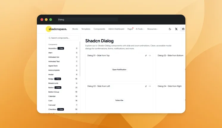
Modals break when you skip focus trapping, scroll locking, or escape handling. Dialog renders an accessible modal that manages focus, the backdrop, and close behavior for you. You control the open state, size, and content while accessibility is handled by default. That keeps confirmation prompts and forms working for keyboard and screen-reader users.
Variations: 6
Use cases
- Confirmation prompts
- Form submissions in a modal
- Detail views and previews
- Onboarding or alert messages
- Delete and warning confirmations
Best for: Showing focused content or actions without leaving the page.
Dropdown Menu
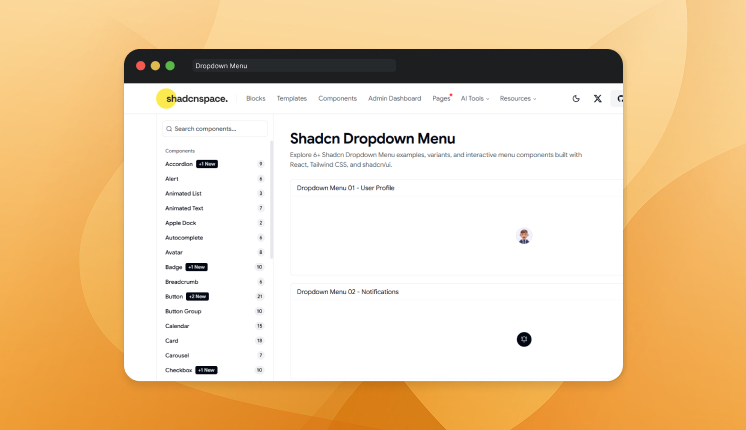
Custom dropdowns usually skip keyboard support and break on mobile. Dropdown Menu opens a list of actions from a trigger with arrow-key navigation, submenus, and checkbox items. You control alignment, grouping, and disabled states through clear props. That replaces a fragile hand-built menu with one that handles the edge cases.
Variations: 6
Use cases
- User account menus
- Action menus on cards or rows
- Filter and sort controls
- Settings shortcuts
- Multi-level navigation
Best for: Grouping related actions behind a single trigger.
Input Mask
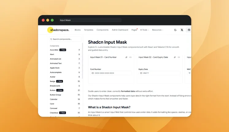
Free-text fields for phone numbers and dates produce messy, inconsistent data. Input Mask formats values as the user types, enforcing a pattern for fields like dates, cards, and phone numbers. You define the mask format and the component handles spacing and separators. That keeps structured data clean at the point of entry instead of fixing it later.
Variations: 3
Use cases
- Phone number fields
- Credit card entry
- Date and time inputs
- Postal or ZIP codes
- Currency formatting
Best for: Keeping structured input clean and consistent at entry.
Input OTP
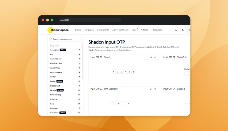
One-time code fields look trivial until you handle paste, auto-advance, and backspace across separate boxes. Input OTP splits a verification code into individual slots with automatic focus movement and paste support. You set the length and validation, and the focus logic is handled for you. That turns a fiddly multi-input pattern into a single drop-in component.
Variations: 10
Use cases
- Two-factor authentication
- Email or phone verification
- Login security codes
- Payment confirmation
- Password reset flows
Best for: Collecting short verification codes with clean focus handling.
KBD
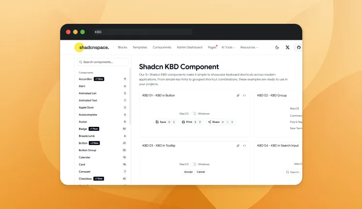
Keyboard shortcuts written as plain text are hard to scan in documentation. KBD renders styled keyboard keys so shortcuts look like actual buttons. You wrap the key labels and the component handles with consistent spacing and styling. That makes shortcut hints readable inside docs, tooltips, and command palettes.
Variations: 5
Use cases
- Documenting keyboard shortcuts
- Command palette hints
- Tooltip shortcut labels
- Help and onboarding screens
- Developer-facing tools
Best for: Displaying keyboard shortcuts in a clear, readable format.
Label
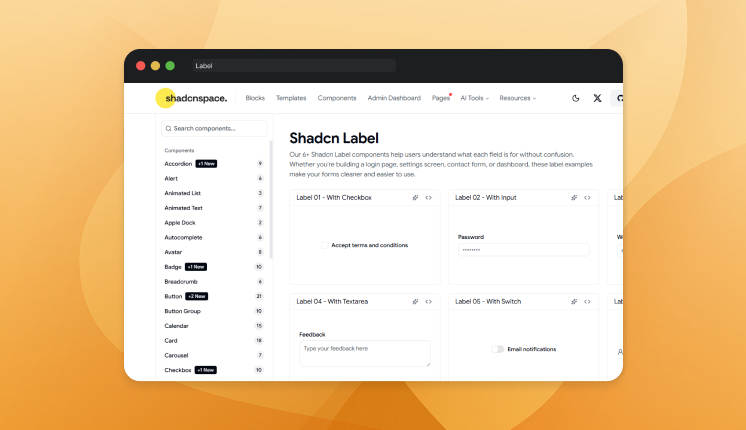
Inputs without proper labels fail accessibility checks and confuse screen readers. Label connects text to a form control so clicks and focus behave correctly. You link it to an input by ID, and the association stays accessible by default. That keeps every field readable for both users and assistive tech.
Variations: 6
Use cases
- Form field labels
- Checkbox and radio descriptions
- Required field indicators
- Grouped input headings
- Accessible form structure
Best for: Tying readable, accessible labels to every form control.
Pagination
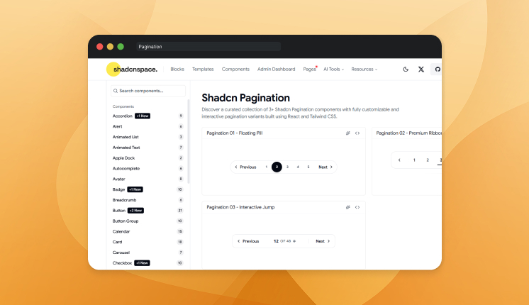
Loading thousands of rows at once slows the page and frustrates users. Pagination splits data into pages with controls for next, previous, and direct page jumps. You control the page count, current page, and sibling range through props. That keeps large datasets fast to load and easy to move through.
Variations: 3
Use cases
- Data tables and lists
- Search result navigation
- Blog and article archives
- Product catalogs
- Admin record browsing
Best for: Breaking large datasets into manageable, navigable pages.
Popover
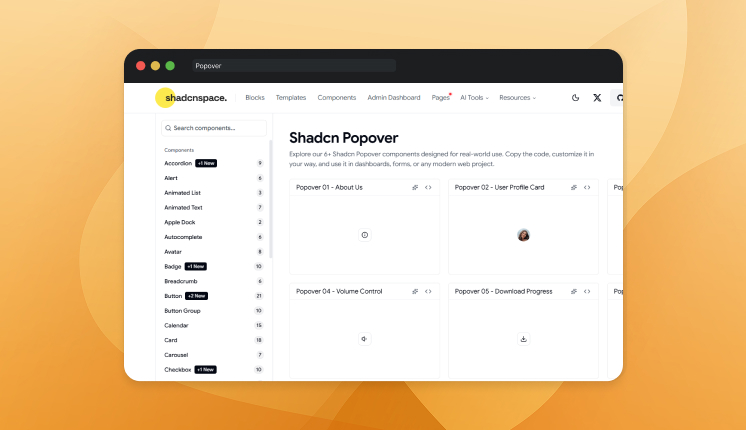
Tooltips cannot hold interactive content, so teams reach for Popover. It floats a panel near a trigger and supports buttons, forms, and rich content inside. You control placement, alignment, and the open state while positioning stays handled. That keeps quick actions anchored to the element they belong to.
Variations: 6
Use cases
- Quick action panels
- Inline forms and filters
- Profile or info cards
- Date and color pickers
- Contextual help content
Best for: Showing interactive content anchored to a trigger.
Radio Group
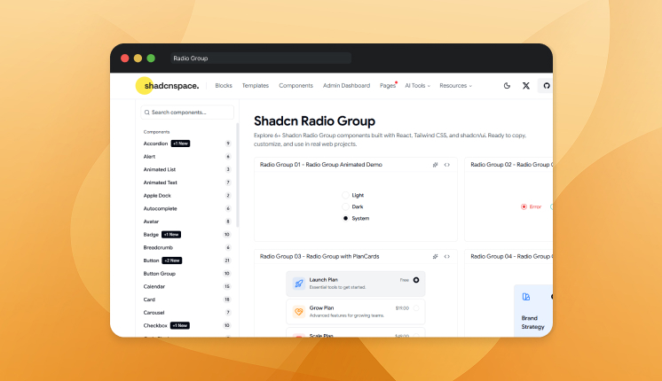
Loose radio inputs lose keyboard navigation and shared selection state. Radio Group ties options together so only one stays selected, with arrow-key movement between choices. You set the value and options, and the group manages selection and focus. That keeps single-choice questions accessible without manual wiring.
Variations: 6
Use cases
- Single-choice form questions
- Plan and pricing selection
- Settings and preferences
- Survey answers
- Payment method choice
Best for: Letting users pick one option from a fixed set.
Scroll Area
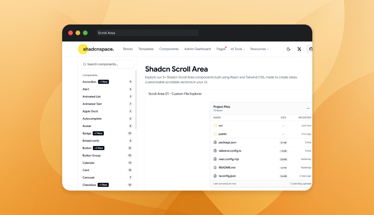
Default browser scrollbars look different across operating systems and break custom layouts. Scroll Area gives you a styled, cross-platform scroll container with full keyboard and touch support. You wrap the overflowing content and control orientation through props. That keeps scrollable regions consistent no matter the browser.
Variations: 3
Use cases
- Sidebars and navigation lists
- Chat and message windows
- Dropdown and select content
- Long settings panels
- Data-heavy containers
Best for: Keeping scrollable regions consistent across browsers.
Separator
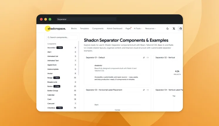
Dividing content with bare borders leads to uneven spacing and missing semantics. Separator draws a clean horizontal or vertical line with proper accessibility roles. You set the orientation, and the component handles spacing and meaning. That gives sections a clear visual break that screen readers also understand.
Variations: 8
Use cases
- Splitting menu sections
- Dividing into groups
- Separating list items
- Layout structure in cards
- Toolbar dividers
Best for: Adding clear visual breaks between sections.
Sheet
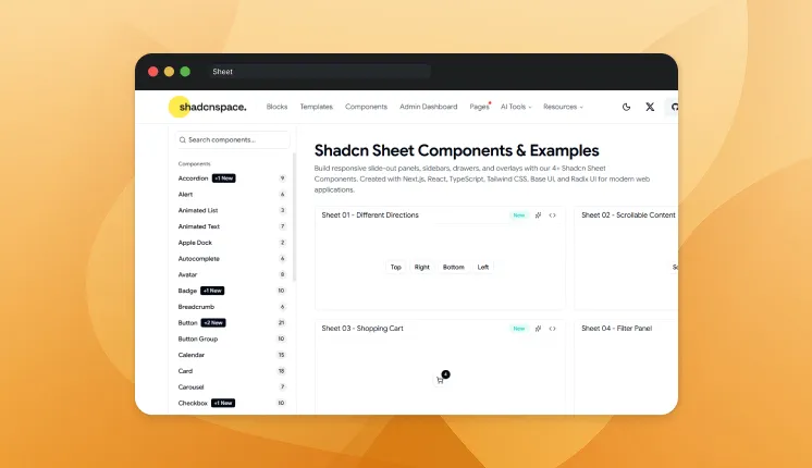
Side panels usually break scroll locking and focus once they slide into view. Sheet renders a panel from any edge of the screen with a backdrop, focus trapping, and close handling built in. You control the side, size, and content while accessibility stays managed. That keeps secondary views accessible without leaving the current page.
Variations: 4
Use cases
- Mobile navigation menus
- Filter and settings panels
- Shopping cart drawers
- Detail and edit views
- Notification panels
Best for: Sliding in secondary content without leaving the current view.
Slider
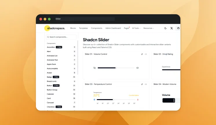
Number inputs feel clumsy when users just want to pick a value in a range. Slider lets users drag along a track to set single values or ranges, with keyboard support included. You set min, max, step, and default values through props. That turns a fussy numeric entry into a quick drag.
Variations: 6
Use cases
- Price range filters
- Volume and brightness controls
- Settings adjustments
- Image editing values
- Quantity selection
Best for: Selecting values within a range through dragging.
Sonner
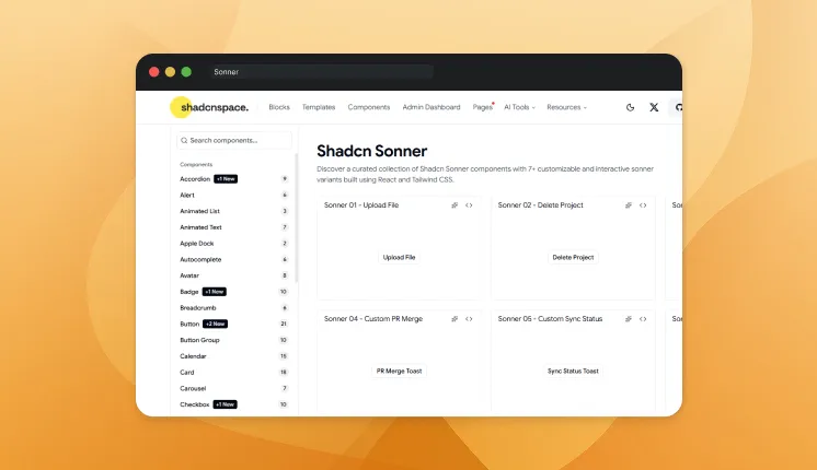
Toast notifications start simple. Then production hits, and you need promise states, action buttons, stacking, and clean animations. Sonner handles toasts with async support, dismiss controls, and custom styling, so you skip building the queue logic yourself. That covers loading-to-done feedback without a custom notification system.
Variations: 7
Use cases
- Success and error feedback
- Async action status (loading to done)
- Undo actions
- Background task updates
- Form submission results
Best for: Delivering non-blocking feedback with async and action support.
Spinner
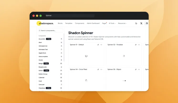
A blank screen during loading can make users think the app has frozen. Spinner shows an animated loading indicator while data or actions resolve. You control size and color, then drop it into buttons, panels, or full-page states. That gives users a clear signal that work is still in progress.
Variations: 10
Use cases
- Button loading states
- Page and section loaders
- Async data fetching
- Form submission feedback
- Lazy-loaded content
Best for: Signaling progress during loading and async work.
FAQ’s
1. How do developers install these components?
Instead of installing a package, developers copy the component source code directly into their project. This allows full customization and avoids dependency conflicts.
2. Why do these components use Base UI or Radix primitives?
These primitives provide accessible interaction patterns like dialogs, tabs, and tooltips while allowing developers to fully control styling with Tailwind CSS.
3. Do Shadcn components support accessibility?
Yes, Shadcn components support accessibility by default. Most components are built on accessible UI primitives that include proper ARIA attributes, keyboard navigation, and structured semantic behavior. They also manage focus correctly (such as trapping focus in modals and restoring it afterward), ensuring compatibility with screen readers and assistive technologies for production-grade interfaces.
Final Thoughts
Shadcn components change how developers think about UI libraries. Instead of installing a heavy dependency and fighting customization limits, you simply add the components you need and own the actual code inside your project. This copy-paste workflow gives you full control over styling, logic, and structure while still leveraging modern technologies like React, Tailwind CSS, and accessible UI primitives.
For developers building modern dashboards, SaaS products, or interactive interfaces, this approach provides the flexibility to scale a design system without framework lock-in. With components ranging from simple inputs to animated UI elements, you can ship faster while maintaining complete control over your frontend architecture.
If you’re looking to build complete UI sections rather than individual components, we’ve prepared this guide to Shadcn blocks that explains how ready-made layout blocks can speed up dashboard and landing page development.
To explore more tools in the ecosystem, we’ve also created a guide covering popular Shadcn libraries that developers use to extend their React UI systems.