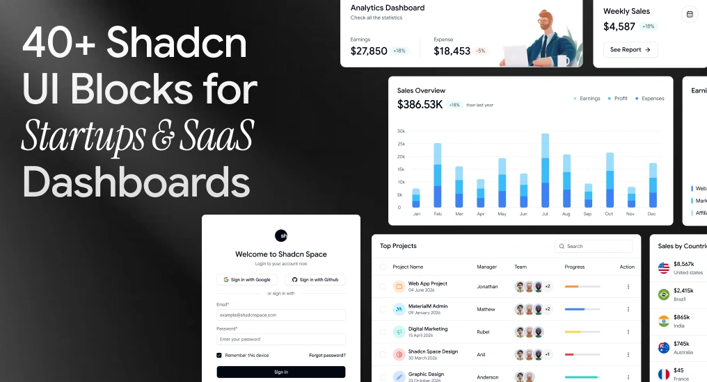
When you’re building a SaaS product, admin dashboard, or internal tool, writing UI from scratch slows everything down. That’s why modern teams are moving toward Shadcn blocks – composable, accessible, and production-ready UI sections built on Shadcn, Radix UI, Base UI, and Tailwind CSS.
In this guide, we’ll explore over 40+ essential Shadcn UI blocks for startups, highlight real-world examples with code, and explain how to integrate them into real products.
This article is written for developers, founders, and product teams building with React, Next.js, and Tailwind CSS.
For more information and better clarity, visit our official documentation guide.
What are Shadcn Blocks?
Shadcn blocks are prebuilt UI sections composed of multiple Shadcn components. These blocks typically include layouts such as:
- Dashboards
- Sidebars
- Auth pages
- Pricing sections
- Tables
- Forms
- Settings pages
Instead of assembling the UI from scratch, you copy a block, drop it into your codebase, and adapt it to your product’s data and logic.
Shadcn Space Blocks Features
| Feature | Description |
| Responsive Previews | View block layouts across mobile, tablet, and desktop screens. |
| Install Anywhere | Install blocks via CLI using pnpm, npm, yarn, or bun. |
| Open in v0 | Preview blocks live and edit them in v0 with one click. |
| Theme Toggle (Light/Dark) | Built-in support to switch theme styles. |
| Figma Preview | Access corresponding Figma designs for each block. |
| Copy-Paste Ready | Copy the JSX directly into your React or Next.js project. |
40+ Essential Shadcn UI Blocks for Startups
Below are the most commonly used blocks across SaaS and startup products.
Agency Hero Section
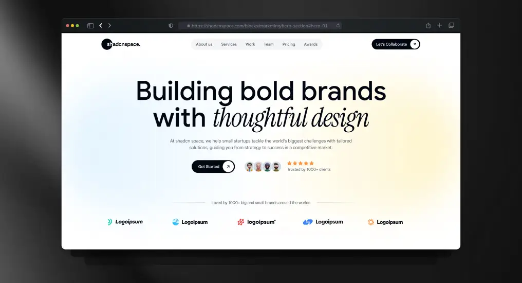
A conversion-focused hero layout built for service-based and product-driven teams. Uses clear typography hierarchy, CTA prioritization, and responsive spacing to establish intent immediately. Designed to plug directly into marketing or product entry pages without refactoring.
Use Cases
- SaaS landing page hero
- Agency or studio homepage
- Product launch announcement
- Startup marketing website
- Campaign-specific landing page
Three-Tier Pricing Layout Section
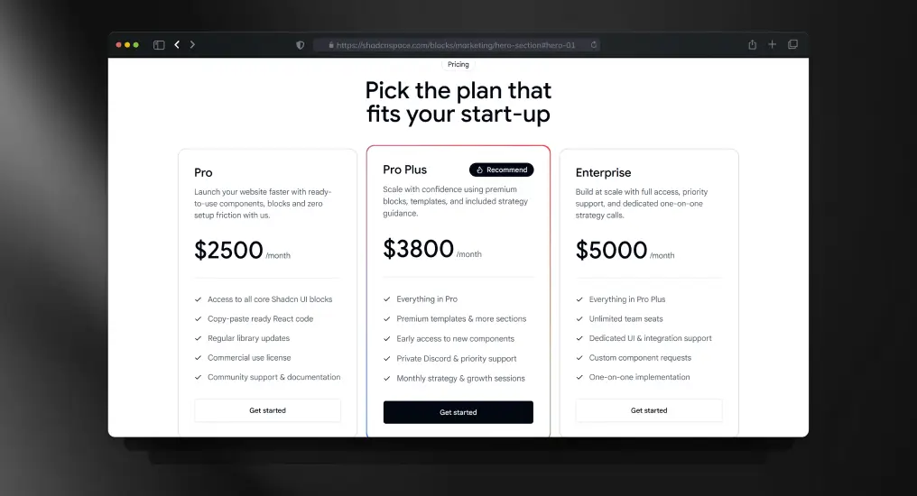
A structured pricing block with three plan tiers optimized for comparison clarity. Supports scalable pricing models and maps cleanly to Stripe or custom billing logic. Keeps pricing decisions frictionless for users.
Use Cases
- SaaS subscription pricing
- Plan comparison pages
- Early-stage MVP pricing
- Startup vs enterprise plans
- Product monetization pages
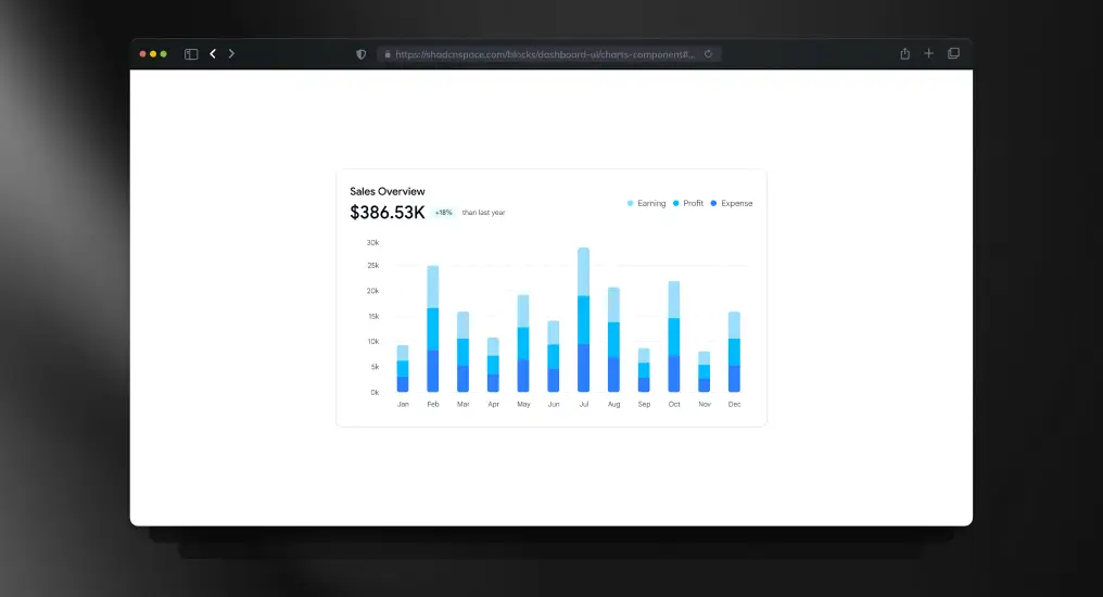
Sales & Profit Overview Chart
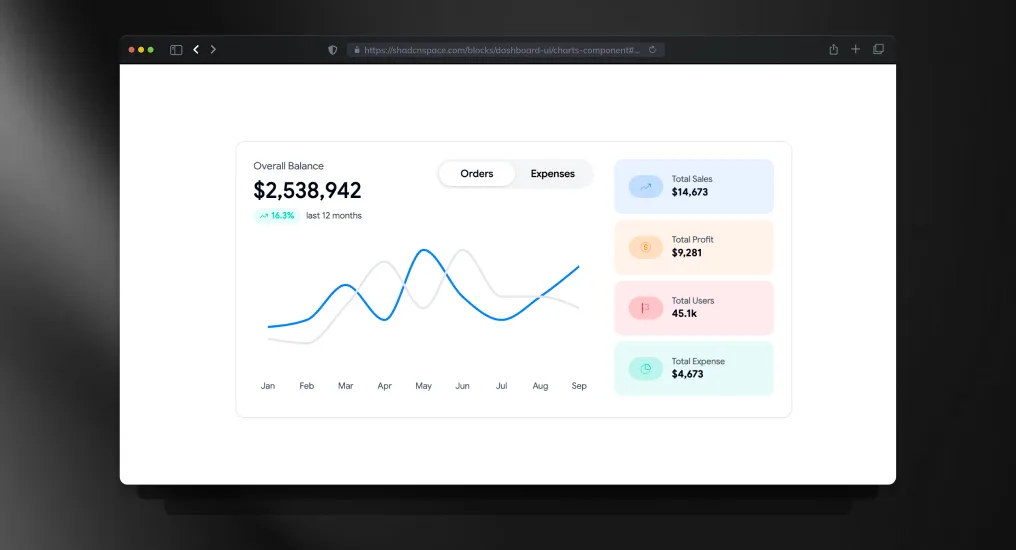
A comparative analytics chart block designed for tracking revenue and profit trends together. Uses balanced chart spacing and responsive containers to keep dashboard insights readable across all breakpoints.
Use Cases
- Revenue vs profit comparison
- Financial reporting dashboards
- Business growth analytics
- KPI monitoring panels
- SaaS analytics overview
About Us Section
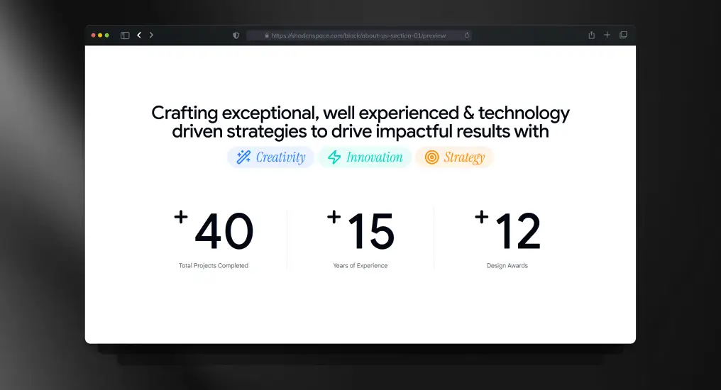
A lightweight content section for communicating the company’s mission, vision, or background. Designed to be readable without interrupting primary navigation or conversion flows. Easy to adapt for static or CMS-driven content.
Use Cases
- About the company page
- Startup story section
- Mission & vision content
- Team introduction area
- Brand narrative pages
Three Columns Feature with Icons
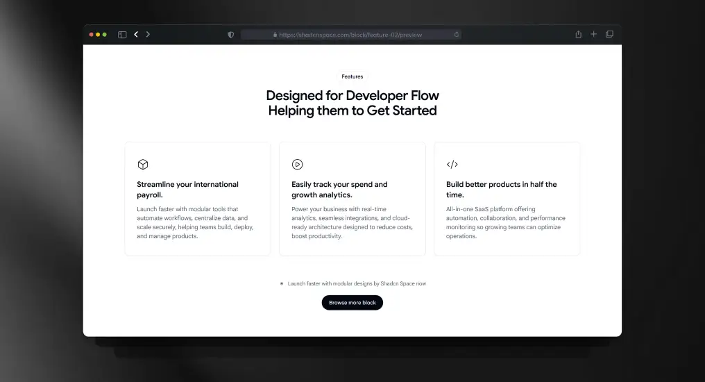
A feature listing block with icon support and equal-width columns. Designed to keep content scannable while maintaining consistent spacing and alignment across breakpoints.
Use Cases
- Product feature highlights
- Homepage value propositions
- Competitive comparison sections
- Post-hero content blocks
- Marketing feature summaries
Multi-Column Footer Layout
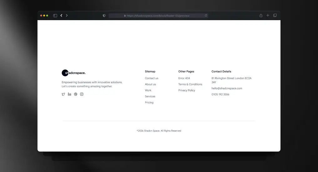
A structured footer layout with multiple link groups and brand context. Acts as a stable layout anchor across marketing and application pages. Designed for extensibility without visual clutter.
Use Cases
- Site-wide footer
- Legal and policy links
- Resource navigation
- Newsletter signup area
- Marketplace or SaaS footer
Testimonial Slider Showcase
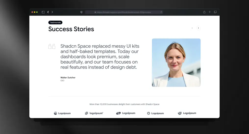
A testimonial carousel block designed for dynamic or static data sources. Preserves layout stability while cycling content, making it suitable for performance-sensitive landing pages.
Use Cases
- Social proof sections
- Customer success highlights
- Case study previews
- Trust-building on landing pages
- Product credibility sections
Navigation Bar Block
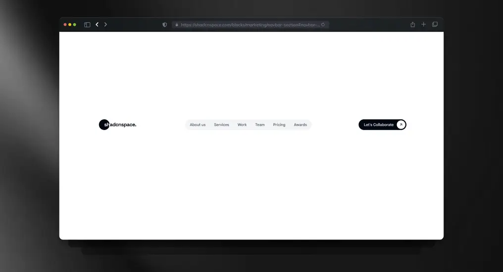
A responsive top navigation bar supporting branding, links, and action items. Handles layout shifts cleanly across screen sizes and works for both public and authenticated states.
Use Cases
- Marketing website navigation
- Logged-in app header
- Sticky navigation layouts
- Dropdown menu integration
- Product navigation bar
Gradient CTA Block
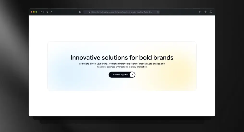
A visually distinct call-to-action section using gradient emphasis without sacrificing readability. Designed to reduce distraction and guide users toward a single primary action.
Use Cases
- Signup prompts
- Early access invitations
- Product demo CTAs
- Newsletter subscriptions
- Conversion-focused sections
Project Inquiry Contact Form
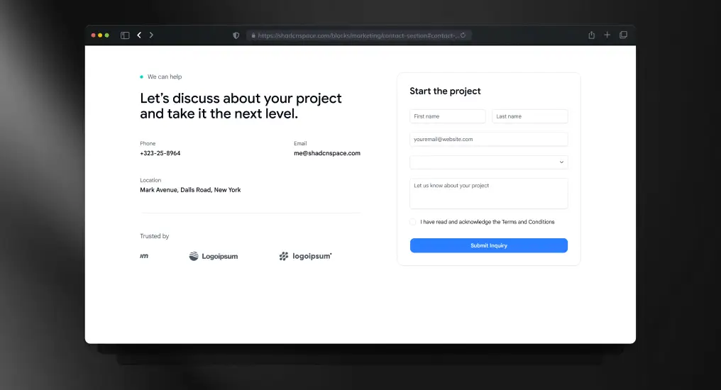
A form-centric contact block designed for direct integration with API routes or third-party handlers. Keeps layout minimal while supporting validation and submission feedback.
Use Cases
- Contact pages
- Project inquiry forms
- Partnership requests
- Support ticket entry
- Lead capture forms
Product Quick View (Multi-Image Grid)
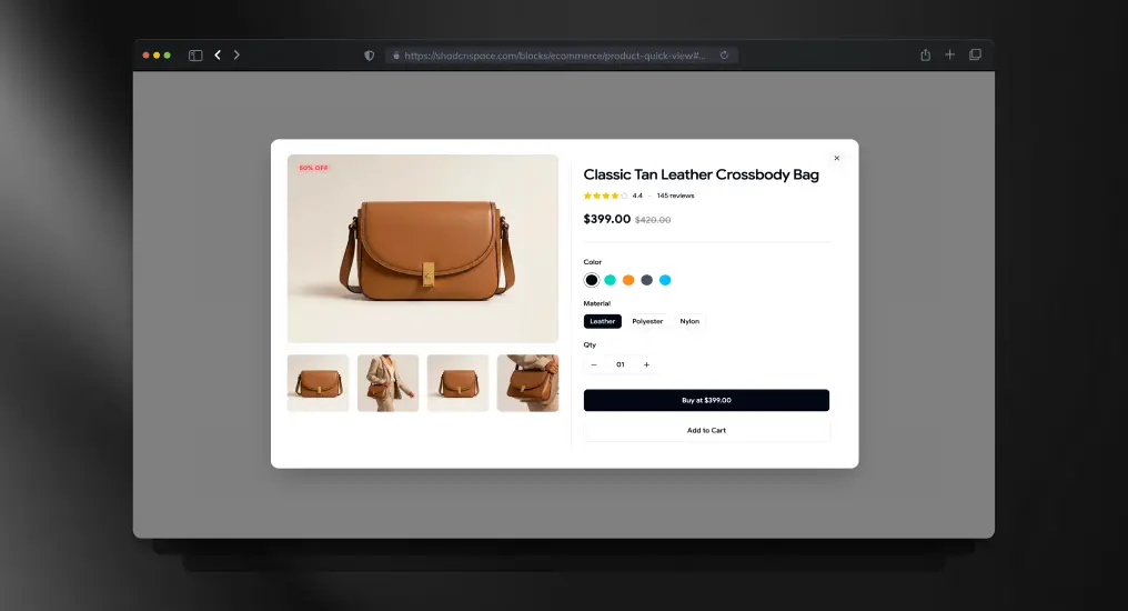
A product preview block with a multi-image gallery layout for faster product exploration. Keeps users inside the browsing flow while exposing important product visuals and purchase actions.
Use Cases
- E-commerce quick preview
- Fashion product browsing
- Marketplace product showcase
- Upsell product cards
- Catalog browsing flows
Accordion-Style FAQ Section
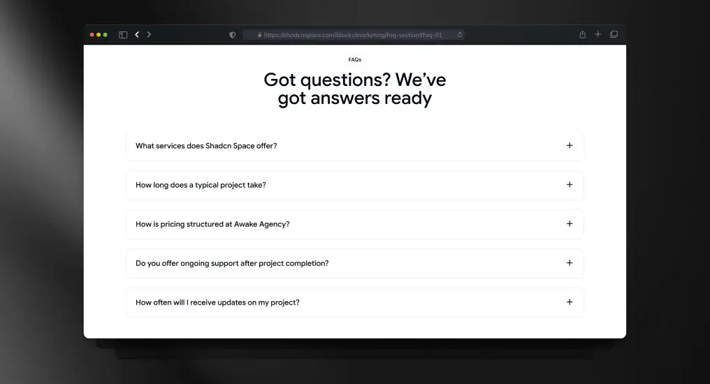
An expandable FAQ layout optimized for readability and SEO. Keeps long-form content compact while allowing users to scan and reveal only relevant answers.
Use Cases
- Product FAQs
- Pricing clarification sections
- Documentation pages
- Sales enablement content
- Support resources
Login Page Block
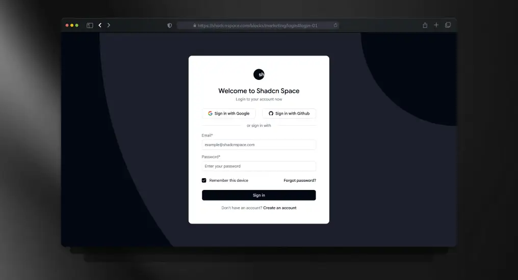
A standard authentication layout supporting email/password and external providers. Designed to integrate with any auth system without enforcing implementation details.
Use Cases
- SaaS login pages
- Customer portals
- Admin access screens
- Secure app entry points
- Auth gateway pages
Sign-Up Page Block
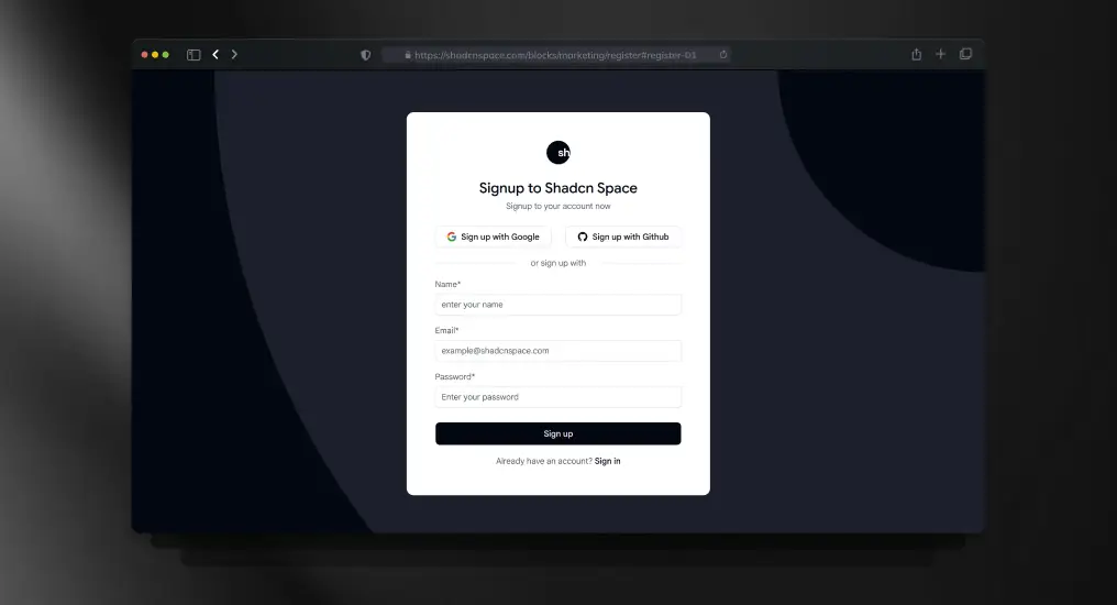
A full registration layout supporting validation, onboarding flows, and progressive disclosure. Built to scale from simple signup to complex onboarding.
Use Cases
- New user registration
- Beta access signup
- Email-based onboarding
- Product trial entry
- Account creation pages
Two-Factor Authentication Page
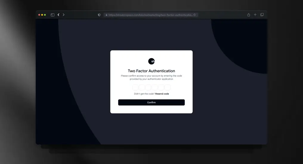
A focused verification layout for OTP or security codes. Designed to minimize cognitive load during sensitive authentication steps.
Use Cases
- Secure login flows
- Financial dashboards
- Admin verification steps
- Account protection layers
- Sensitive action confirmation
Forgot Password Page
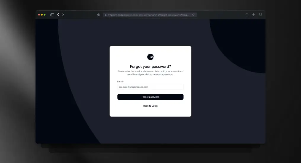
An isolated password recovery layout designed to keep authentication flows predictable and simple. Easily integrates with email-based reset systems.
Use Cases
- Password recovery
- Account maintenance
- Support workflows
- Credential reset flows
- Auth error recovery
Unified Integrations Block
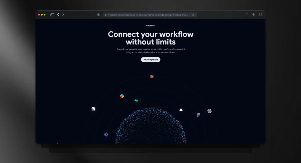
A structured integrations section for showcasing connected tools, APIs, and platform compatibility. Designed to improve product discoverability without cluttering the interface.
Use Cases
- SaaS integrations showcase
- API ecosystem pages
- Technology partner section
- Workflow automation products
- Developer platform marketing
Email Verification Page
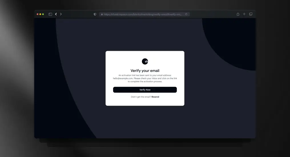
A post-registration verification layout used to gate full product access. Keeps users focused on completing activation without distraction.
Use Cases
- Account activation
- Email confirmation flows
- Post-signup onboarding
- Security enforcement
- Access gating pages
Dashboard Shell
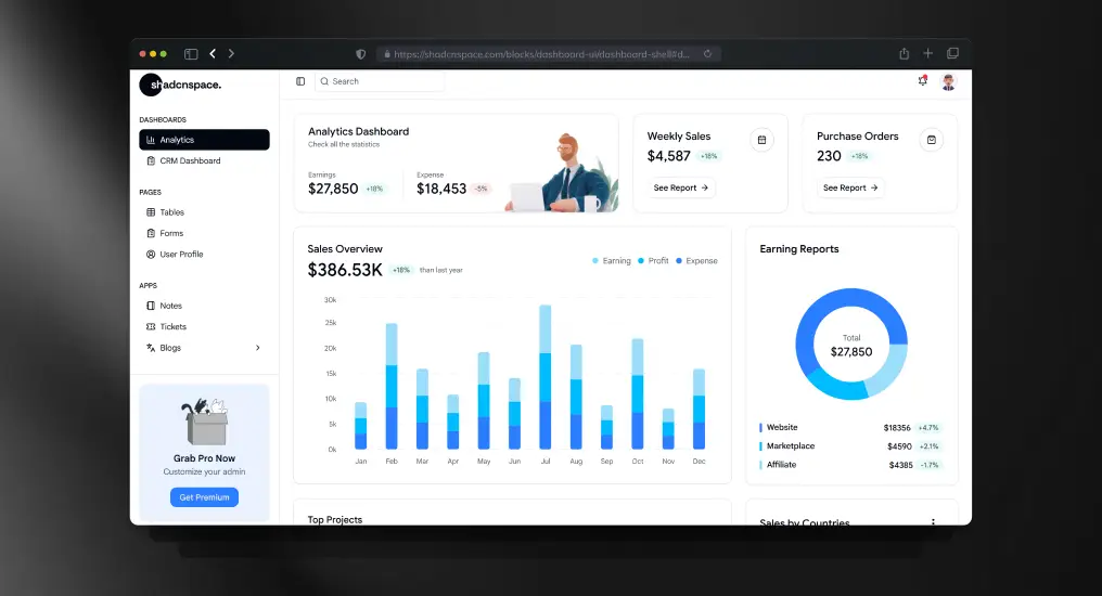
A master application layout combining sidebar and main content regions. Establishes a consistent structure for complex, multi-view interfaces.
Use Cases
- SaaS admin dashboards
- Analytics platforms
- Internal tools
- Multi-module applications
- Back-office systems
Sales Performance Bar Chart
A chart-focused block optimized for performance and clarity. Abstracts layout concerns while remaining chart-library agnostic.
Use Cases
- Revenue tracking
- Sales analytics
- KPI dashboards
- Performance reports
- Business intelligence views
Statistics Section with KPI Cards
A compact metrics block designed to surface high-signal data at a glance. Ideal for executive summaries and dashboard overviews.
Use Cases
- KPI dashboards
- Executive reporting
- Daily metrics display
- Performance snapshots
- Summary panels
Analytics Overview Widget
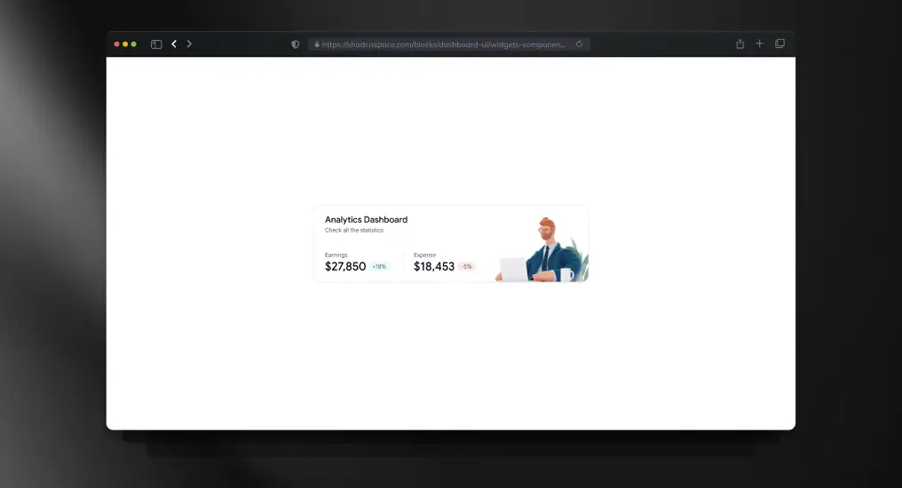
A modular widget block for displaying focused analytics or quick insights. Designed to compose easily into customizable dashboards.
Use Cases
- Personalized dashboards
- Mini analytics panels
- Real-time indicators
- Notification widgets
- Quick insights views
Data Table Block
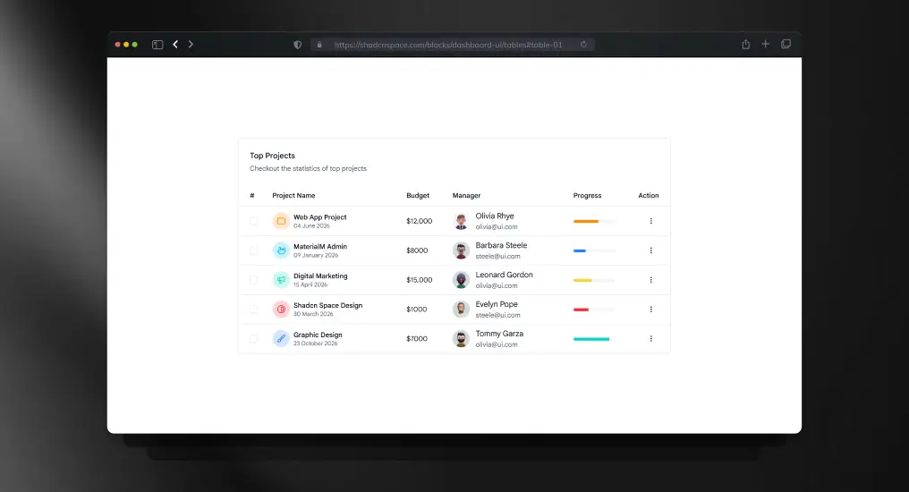
A structured table layout supporting extension for sorting, pagination, and row actions. Designed for readability and large datasets.
Use Cases
- User management tables
- Orders and transactions
- Logs and audit trails
- Admin data grids
- Reporting interfaces
Product Overview Block
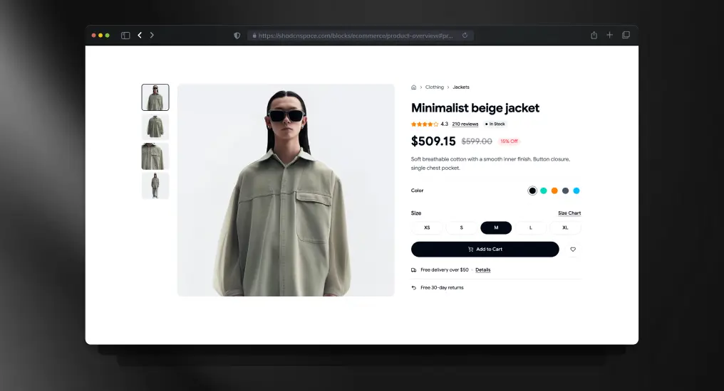
A product detail layout focused on fashion and apparel presentation. Combines media, pricing, and variant sections into a conversion-oriented shopping experience.
Use Cases
- Fashion ecommerce stores
- Apparel product pages
- D2C product showcase
- Marketplace listings
- Brand catalog pages
Admin Dashboard Sidebar
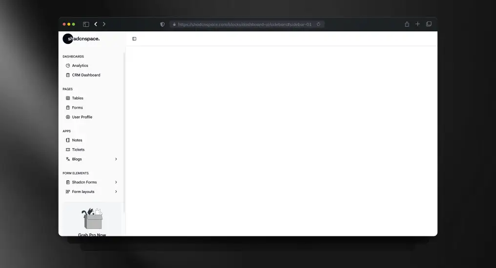
A vertical navigation sidebar optimized for long-lived applications. Supports role-based navigation and scalable menu structures.
Use Cases
- Admin dashboards
- Feature-rich SaaS apps
- Internal tooling
- Role-based navigation
- Persistent app layout
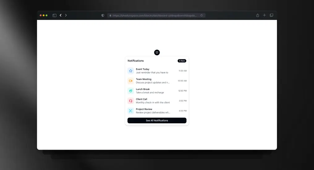
Simple Topbar Block
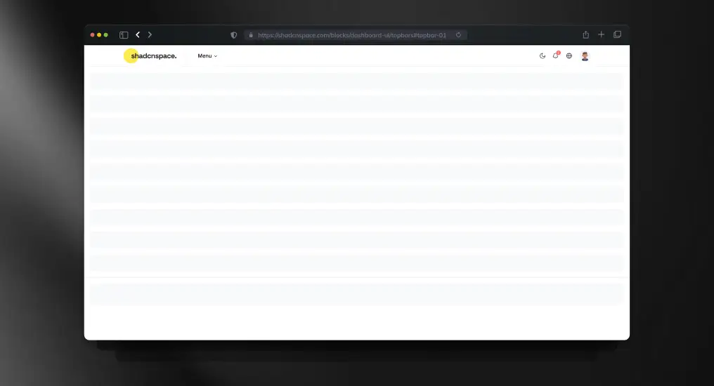
A minimal topbar layout designed for global actions and context-aware controls. Commonly paired with dashboards and internal tools.
Use Cases
- Search and command access
- Notifications area
- App-level actions
- Dashboard headers
- Branding placement
Newsletter Subscription Dialog
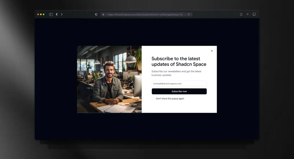
A modal-based subscription block designed to capture emails without disrupting user flow. Keeps background context intact during interaction.
Use Cases
- Newsletter signup
- Product updates opt-in
- Marketing campaigns
- Lead generation modals
- Feature announcements
User Profile Dropdown
A compact dropdown menu for user-specific actions. Designed to keep action density high without cluttering the interface.
Use Cases
- Profile menus
- Account actions
- Contextual navigation
- User settings access
- Authenticated headers
Edit Profile Form
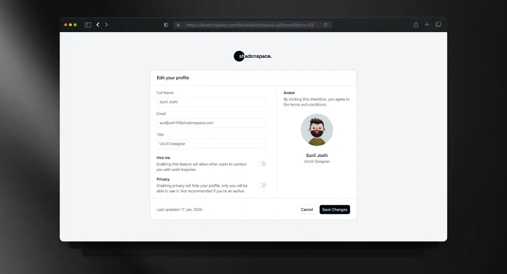
A full form layout optimized for settings and profile updates. Balances readability with validation and error handling patterns.
Use Cases
- User profile editing
- Account settings pages
- Preference management
- Personal information updates
- Form validation examples
Revenue Insights Card
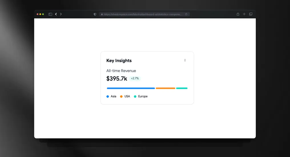
A compact statistics card designed for displaying high-priority revenue insights and trend indicators. Optimized for dashboard summaries and executive-level reporting.
Use Cases
- Revenue tracking
- Financial KPI cards
- Executive dashboards
- SaaS growth reporting
- Business intelligence panels
Product Tabbed Category Block
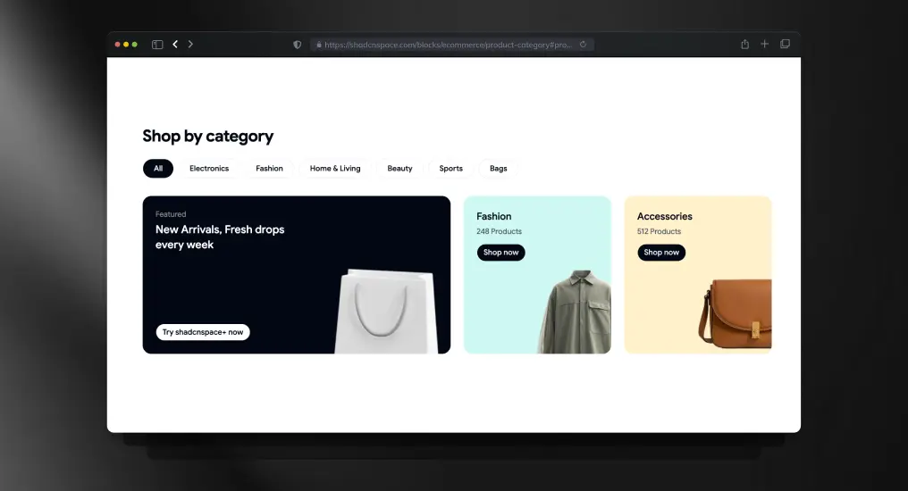
A tab-driven product category layout that organizes catalog sections without forcing page reloads. Keeps browsing structured while improving category discoverability.
Use Cases
- E-commerce category pages
- Product filtering layouts
- Marketplace navigation
- Catalog organization
- Featured collections showcase
Invite Dialog Block
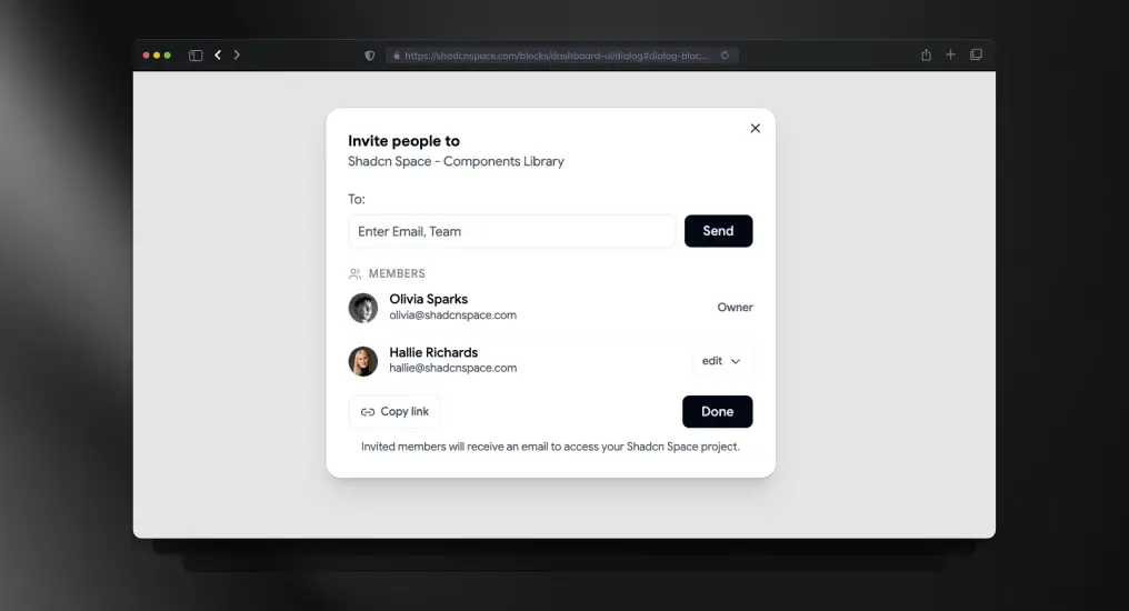
A dialog-based invite flow designed for onboarding users into collaborative applications. Keeps actions contextual while reducing navigation interruptions.
Use Cases
- Team invitation flow
- Workspace onboarding
- Admin user management
- Collaboration tools
- Multi-user SaaS platforms
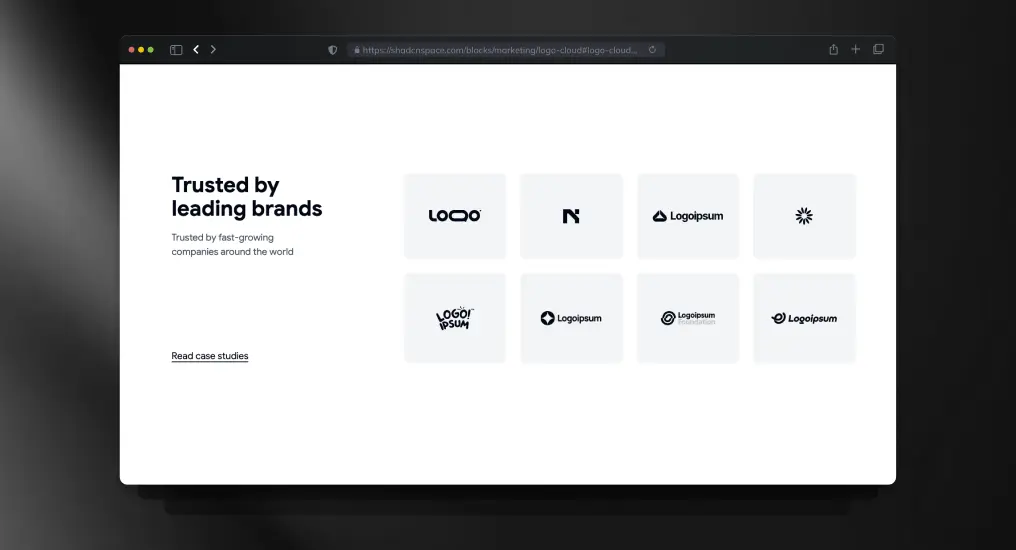
Logo Cloud Block
A responsive logo cloud layout built for displaying brand partnerships and customer trust indicators. Maintains alignment consistency across varying logo dimensions.
Use Cases
- Brand credibility sections
- Enterprise trust showcase
- Customer partnership pages
- SaaS landing pages
- Social proof sections
Team Section Block
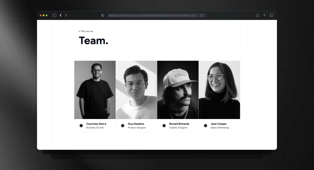
A structured team showcases a layout with profile cards and role hierarchy support. Designed for startup, agency, and product company introductions.
Use Cases
- Team introduction page
- Startup leadership showcase
- Agency member profiles
- Company culture section
- About us expansion
SaaS Navigation Menu
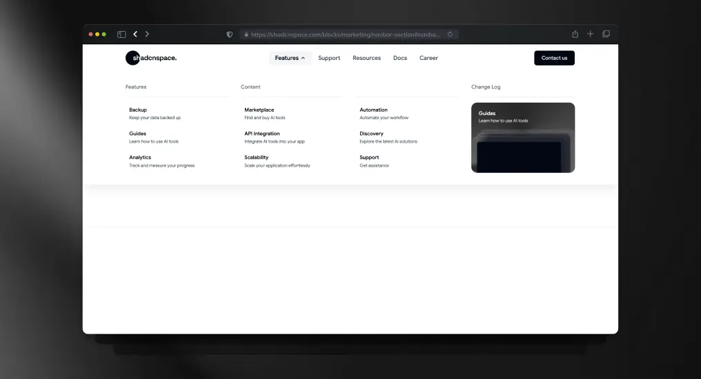
A scalable SaaS navigation layout supporting grouped menus, dropdowns, and multi-level product structures. Optimized for complex product ecosystems.
Use Cases
- SaaS platform navigation
- Multi-product navigation
- Enterprise application menus
- Developer platform headers
- Documentation portals
Service Showcase Block
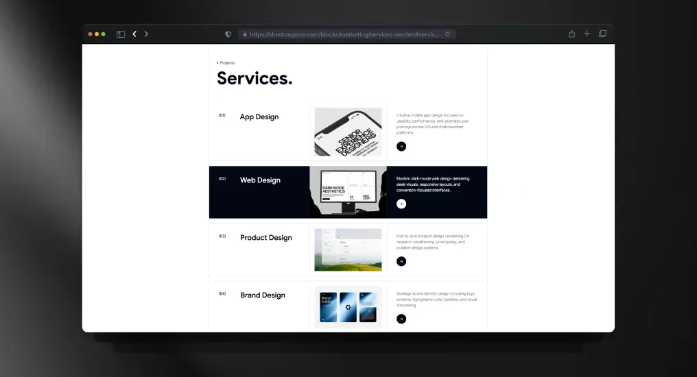
A service-focused content block for highlighting offerings with structured layouts and supporting visuals. Keeps information scannable without reducing content depth.
Use Cases
- Agency services page
- Consulting the business website
- SaaS feature services
- Digital studio showcase
- Productized service offerings
Editorial Blog Block
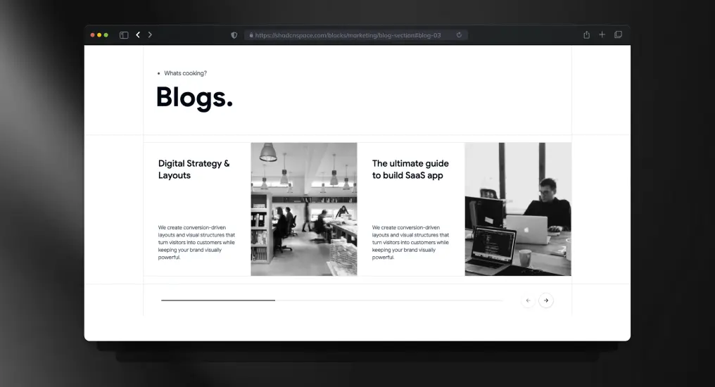
A content-driven blog layout optimized for editorial publishing and article discovery. Designed to improve readability and content hierarchy across devices.
Use Cases
- Developer blog homepage
- Editorial publishing platform
- SaaS content marketing
- Knowledge base previews
- Technical article listings
Bio Link Block
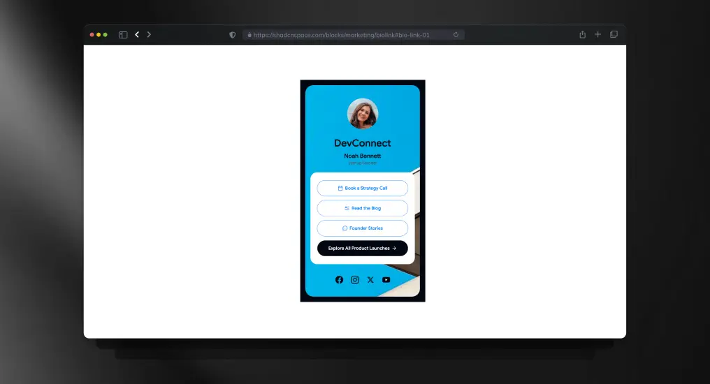
A compact bio link layout for creators, founders, and developers managing multiple destinations. Optimized for mobile-first profile sharing.
Use Cases
- Founder profile page
- Creator link hub
- Social media bio links
- Personal branding page
- Developer portfolio access
Product Listing Block
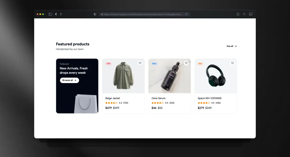
A product listing layout combined with a promotional banner section for driving highlighted campaigns alongside catalog browsing.
Use Cases
- E-commerce storefront
- Promotional sales pages
- Featured collections
- Marketplace product grids
- Seasonal product campaigns
E-commerce Checkout Form Block
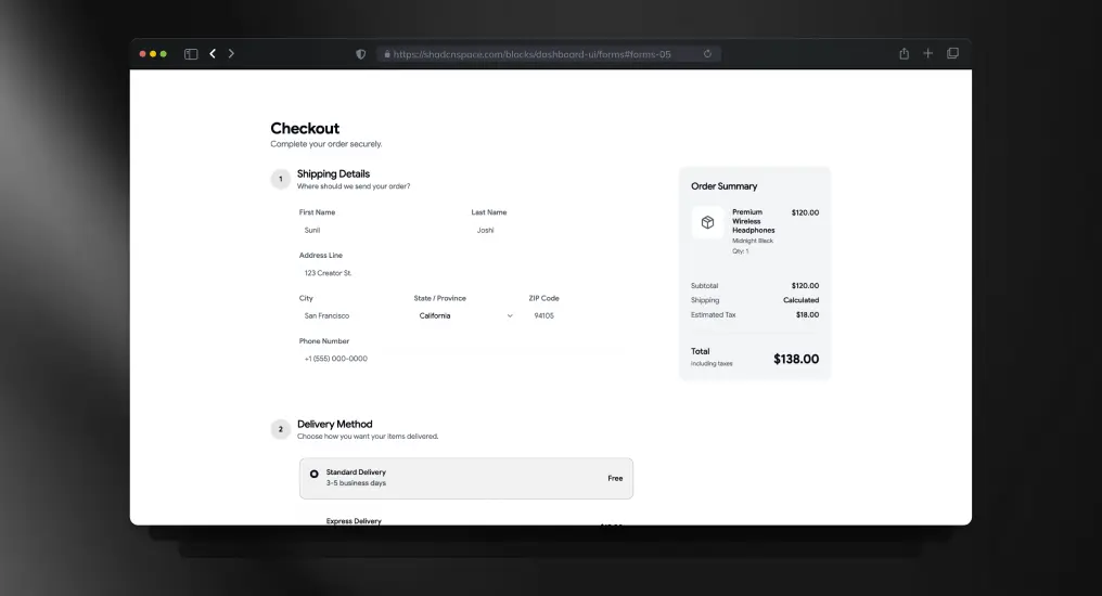
A structured checkout form layout designed for transactional clarity and minimal friction during purchase flows.
Use Cases
- E-commerce checkout
- Billing information entry
- Shipping address forms
- Subscription purchase flows
- Online payment pages
Stacked Portfolio Section
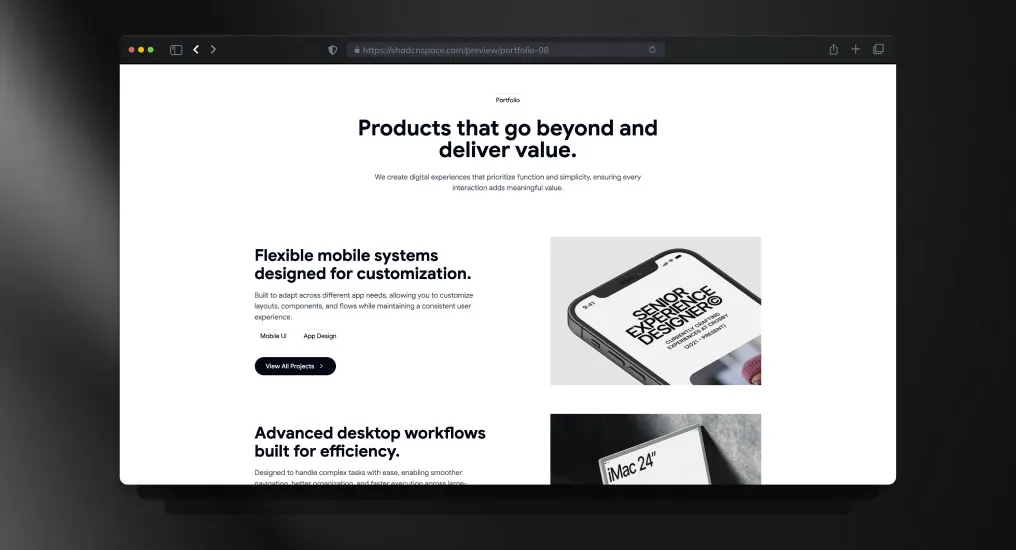
A vertically stacked portfolio layout built for showcasing projects, case studies, or product work with a strong visual hierarchy.
Use Cases
- Designer portfolio
- Developer showcase
- Agency project gallery
- Startup case studies
- Product launch archive
Gallery Block
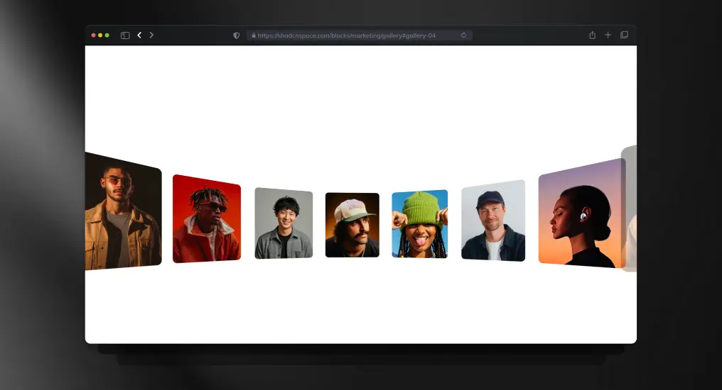
A media-focused gallery layout optimized for creators, studios, and visual portfolios. Maintains responsive image balance without breaking layout consistency.
Use Cases
- Creator portfolio
- Photography showcase
- Visual storytelling pages
- Digital art gallery
- Media-rich landing pages
FAQ’s
1. Are Shadcn Space blocks free to use in commercial projects?
Yes – Shadcn Space blocks are free, open source, and can be used in both personal and commercial projects with no licensing restrictions. You can copy, modify, and ship them in production without attribution requirements.
2. Can I customize Shadcn UI blocks after copying them?
Absolutely. Since Shadcn UI blocks are not a locked component library, you fully own the code. You can customize layouts, styles, components, and logic using Tailwind CSS, CSS variables, or your own design system.
3. Do Shadcn Space blocks support dark mode?
Yes. All Shadcn UI blocks support light and dark themes using CSS variables and Tailwind’s theming patterns, making them easy to integrate with existing theme toggles.
4. Can I install blocks via CLI?
Absolutely – use pnpm, npm, yarn, or bun to install blocks directly.
5. Is Figma design support available for these blocks?
Yes. Each block includes an associated Figma preview, allowing designers and developers to collaborate more effectively between design and code.
Final Thoughts
Shadcn blocks from Shadcn Space provide a developer-friendly, production-ready UI foundation that accelerates design to code without lock-in. Whether you’re launching an MVP, building an admin dashboard, or scaling your SaaS UI, these blocks save hours of development time while retaining full customization control.
Start building faster – drop in blocks, tweak styles, and ship interfaces you’re proud of. Also, if you are looking for Shadcn Templates, you can check WrapPixel.
If you’re exploring the ecosystem further, we’ve also prepared a detailed guide on Shadcn libraries to help you get started.