Key Takeaways
- There are 23 Shadcn input components covered here, spanning single-line fields, multi-line textareas, and OTP inputs, including Date, Time, Currency, File, Real-time Validation, Character Counters, Floating Labels, Inline Buttons, Form Textarea, Textarea with Label, OTP Input, and OTP Input Separator.
- Every component installs with a single CLI command using pnpm, npm, yarn, or bun, and the source code is copied directly into your project.
- Components are built on React, Next.js, Tailwind CSS, and Framer Motion, and support both Radix UI and Base UI primitives.
- You own every line of code after installation. There is no runtime dependency, no version lock-in, and nothing to fight when you need to change behavior.
- These components are designed to work well with React Hook Form and validators like Zod or Yup, including the Form Textarea variant, which ships with a complete Zod schema and error messaging out of the box.
- OTP inputs support pattern constraints, controlled state, and visual separators for grouped code entry, making them production-ready for auth and verification flows.
- The core input collection emphasizes accessibility features such as keyboard navigation, focus states, and screen reader support.
You start a form with a single <input> tag. Then the real requirements show up. You need focus rings that match your design system, error states that read correctly to screen readers, a currency field that stays controlled, a password field with a live strength meter, and a file picker that does not look like a 2003 browser default. Suddenly, that one input has turned into a week of edge-case work.
That is the gap these Shadcn Input components close. All components are free, built on React, Next.js, Tailwind CSS, and Framer Motion, and they support both Radix UI and Base UI. You install each one through the official Shadcn CLI using pnpm, npm, yarn, or bun. The code lands directly in your project, so you own every line and can edit it without fighting a package version.
What is Shadcn Input?
A Shadcn Input is a styled, accessible text field you copy into your codebase instead of pulling from a packaged UI library. It uses native HTML input behavior underneath, then layers Tailwind CSS styling and Radix or Base UI primitives on top for focus management and accessibility. The point is ownership. You get readable component code in your components folder, not a black box you import and hope behaves.
This matters because most input libraries trade control for speed. You ship fast, then get stuck when you need to change a focus outline or fix a hydration mismatch in Next.js. Here, the logic sits in your project, so you change behavior directly.
Why Input Components Matter
Inputs look trivial until you count what a single field needs in production. A login form alone wants validation, error messaging, focus states, keyboard navigation, autofill handling, and screen reader labels. Multiply that across signup, checkout, settings, and search, and the input layer becomes one of the most repeated and most bug-prone parts of your UI.
Hand-rolling each variant creates three recurring problems:
- Accessibility drift. Custom inputs often skip proper aria wiring and keyboard focus, which fails audits later.
- Inconsistent states. Disabled, invalid, and read-only styling diverge across pages when each dev builds their own.
- Validation glue. Wiring fields to React Hook Form and Zod by hand gets resolved on every project.
Prebuilt variants fix this once. You get consistent states, working accessibility, and form-library compatibility from the start. That is the reason teams reach for them instead of rewriting the same field.
How I evaluated these input components for production use
Each component on this list was evaluated against five criteria that matter in production, not in a demo:
- Keyboard and screen reader accessibility – does it pass audit without manual fixes?
- React Hook Form compatibility – does it slot in cleanly without custom wiring?
- Controlled-state behavior – does it stay predictable when value is managed externally?
- Animation quality – does motion hold up in real layouts, not just isolated previews?
- Rewrite cost – how much do you need to change before it ships?
If a component failed any of these in a real form context, it did not make the list.
Developer Checklist
Run through this before you wire any input into a form. It catches the issues that usually surface after launch.
- Controlled vs uncontrolled: Decide upfront. Use controls for currency, validation, and counters.
- Accessibility: Confirm label association, keyboard focus, and
ariawiring on each field. - Validation: Connect to React Hook Form with a Zod or Yup schema instead of ad-hoc checks.
- States: Test focus, disabled, read-only, and invalid styling in your actual theme.
- Next.js hydration: Verify no server and client mismatch on fields with dynamic values.
- Package manager: Match the install command to your project (pnpm, npm, yarn, or bun).
- Theme tokens: Confirm spacing, radius, and color match your design system after install.
- Mobile: Check spacing and tap targets on small screens, especially inline-button variants.
Quick Comparison Table
| Component | Best For | Key Feature |
| Input with Date | Scheduling and booking forms | Native date selection with styled field |
| Input with Time | Event and appointment forms | Time entry with consistent formatting |
| Input with Currency | Pricing and checkout flows | Controlled value with currency formatting |
| Form Textarea | Multi-line forms with validation | React Hook Form + Zod schema with error messaging |
| Real-Time Validation | Password and signup fields | Live rule checks as the user types |
| Input with Start Select | Phone and country fields | Leading select for prefixes |
| Input with Character Counter | Bios and limited-length fields | Live character count against a limit |
| Input with Controls | Quantity and stepper fields | Increment and decrement buttons |
| Input with Add-ons | URL and domain fields | Fixed prefix or suffix text |
| Input with Floating Label | Compact form layouts | Animated floating label |
| OTP Input | Authentication flows | Multi-slot code input with constraints |
| Input with Clear Button | Search and filter bars | One-click clear input |
| Input with End Inline Button | Inline action inputs | Button embedded inside the field |
| Input with End Button | Newsletter and subscribe forms | Attached the submit button |
| Input with File | Upload forms | Styled file picker |
| Input with Error | Form validation states | Built-in error display |
| Required Input | Mandatory fields | Required indicator + validation cue |
| Standard Input | General text entry | Base-styled input component |
| Input with Label | Accessible form fields | Label correctly wired to the input |
| Disabled Input | Read-only fields | Clear non-editable styling |
| With Animated Checkmark | Success feedback | Framer Motion validation checkmark |
| Textarea with Label | Support and contact forms | Labeled multi-line input |
| OTP Input Separator | Grouped verification codes | Visual grouping separators |
Installation
Each component installs through the Shadcn CLI. Run one command, and the source code, dependencies, and file placement are handled for you. Here is the pnpm version for the first input:
pnpm dlx shadcn@latest add @shadcn-space/input-01The same command works across package managers. Swap the prefix for npm, yarn, or bun:
npx shadcn@latest add @shadcn-space/input-01yarn dlx shadcn@latest add @shadcn-space/input-01bunx shadcn@latest add @shadcn-space/input-01You need an existing React or Next.js project with shadcn/ui initialized first. If you have not set that up, the getting started guide walks through configuring the CLI, and the CLI page covers registry setup. Prefer watching it run end-to-end? Here is the setup video on YouTube.
Best Shadcn Input Components
You have seen the table. Now, here is what each component does, where it fits, and the one job it does best.
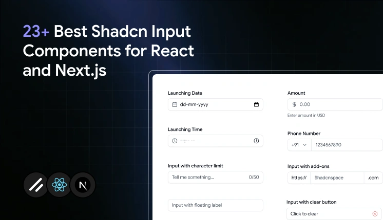
Input with Date
Date fields break the moment you hand-style a native picker, and it renders differently across browsers. This component keeps native date selection but wraps it in a styled field that matches the rest of your form, so the calendar input no longer looks out of place. It stays controlled, which means you can read and set the value cleanly in React state or React Hook Form. Use it anywhere a user picks a single day without you building a custom calendar.
Use cases:
- Booking and reservation forms
- Launch or publish date selection
- Profile fields like date of birth
- Deadline and due-date entry
- Filter ranges in dashboards
Best for: Scheduling and booking forms that need a clean date field.
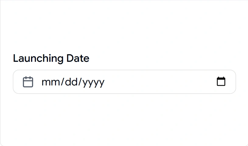
Input with Time
Time entry sounds simple until you deal with formatting, AM/PM handling, and alignment with a date field next to it. This component gives you a styled time input that stays consistent with your date field and keeps its value controlled. It pairs naturally with the date variant for full datetime flows. Drop it into any form where the exact time matters as much as the day.
Use cases:
- Appointment and meeting scheduling
- Event start and end times
- Reminder and alarm settings
- Shift or availability forms
- Delivery window selection
Best for: Event and appointment forms that capture a precise time.
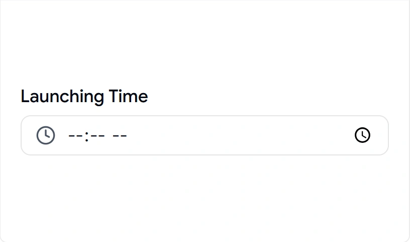
Input with Currency
Money fields are where uncontrolled inputs fall apart. Stray characters, missing decimals, and formatting that fights the cursor all show up fast. This component uses a controlled value with currency formatting, so the displayed amount stays correct while you keep the raw number in state. That separation makes validation and submission predictable. Reach for it any time a user enters a price or amount.
Use cases:
- Checkout and payment forms
- Pricing and plan configuration
- Invoice and billing entry
- Budget and expense inputs
- Donation and tip fields
Best for: Pricing and checkout flows that need clean money entry.
Form Textarea
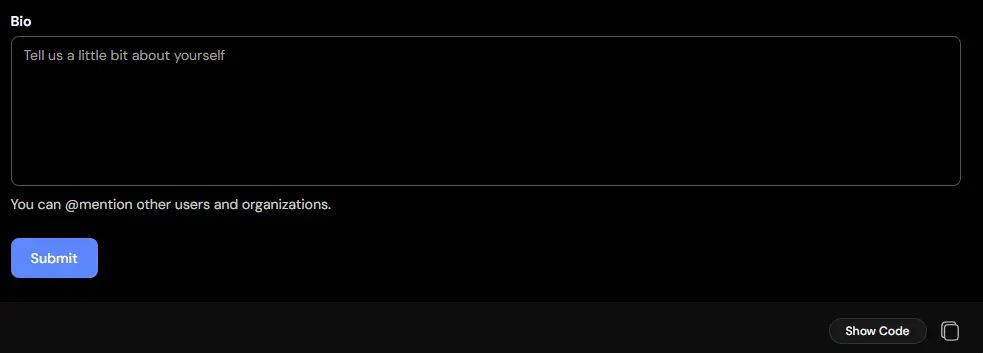
Long-form inputs can feel cramped when users are forced into single-line fields. This component provides a spacious textarea designed for detailed responses, comments, and descriptions while maintaining a clean and consistent form layout. It supports longer content without sacrificing readability or usability. Use it whenever users need room to express more than a short answer.
Use cases:
- Feedback and review forms
- Support requests
- Product descriptions
- Comment sections
- Message and inquiry forms
Best for: Collecting longer responses that require multiple lines of input.
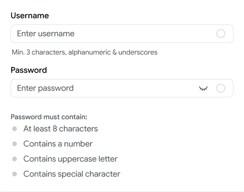
Real-Time Validation
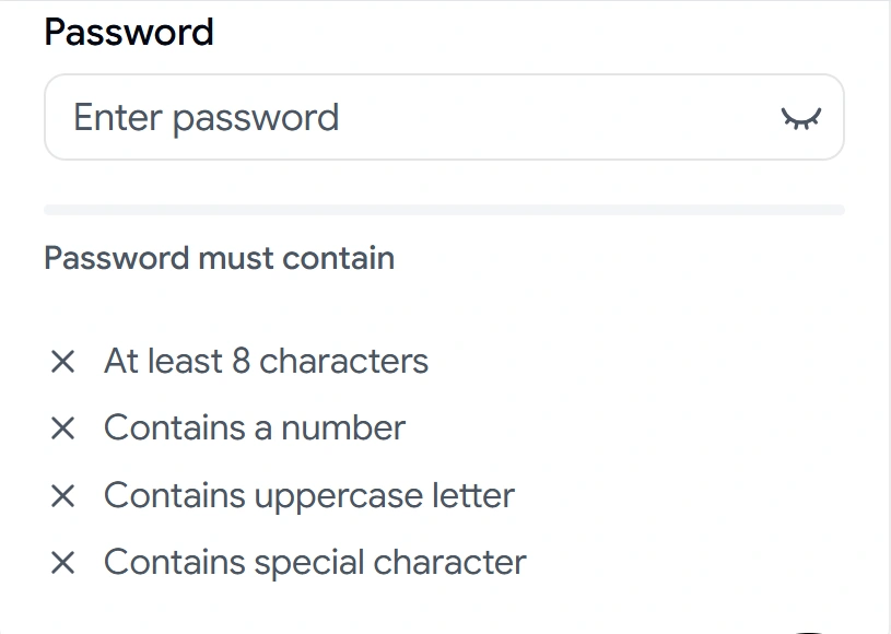
Validating only on submit frustrates users who do not know why a password failed. This component checks rules live as the user types and shows each requirement passing or failing in real time. It covers the common password case with length, number, uppercase, and special-character checks, and the logic is yours to adjust. Use it wherever instant feedback reduces failed submissions.
Use cases:
- Password creation fields
- Signup and registration forms
- Username availability cues
- Strong-format requirements
- Multi-rule validation displays
Best for: Password and signup fields that need live rule feedback.
Input with Start Select
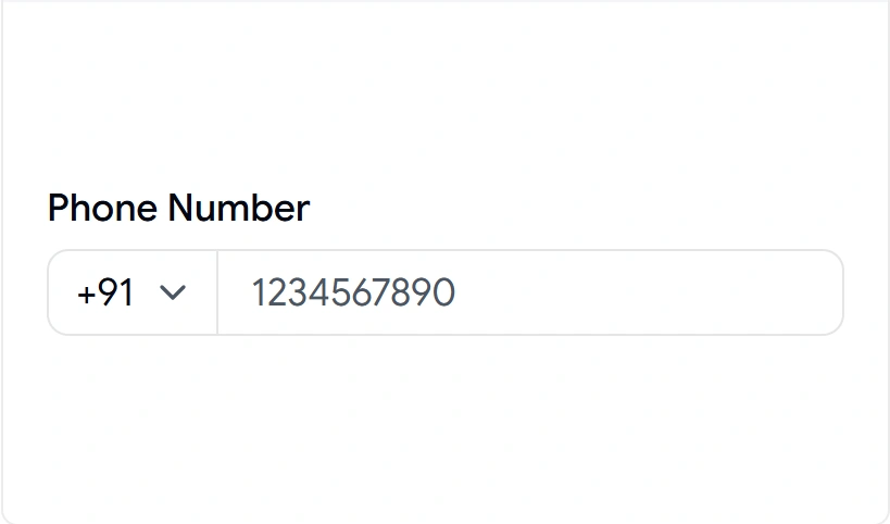
Phone and prefixed inputs get messy when the select and the field are two separate, misaligned controls. This component attaches a leading select to the input so the prefix and value read as one unit. It keeps spacing and focus consistent across the pair. Use it whenever a field needs a dropdown choice before the text, like a country code or unit.
Use cases:
- International phone number entry
- Country or region code selection
- Currency or unit prefixes
- Protocol selection before a URL
- Category-prefixed search
Best for: Phone and country-code fields with a leading select.
Input with Character Counter
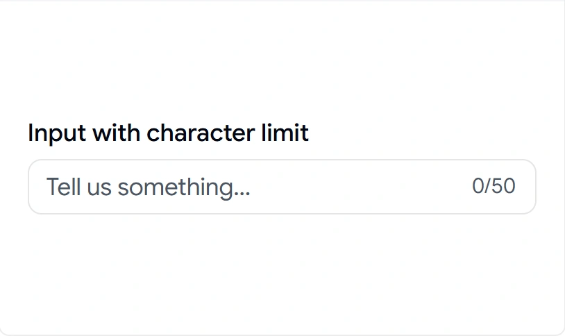
Length limits without feedback lead to silent truncation and confused users. This component shows a live character count against a set limit, like 0/50, so users see how much space remains as they type. It keeps the count in sync with the controlled state. Add it to any field where length is capped, and the user should know it.
Use cases:
- Bio and profile description fields
- Tweet-style short messages
- Meta description entry
- Comment length limits
- SMS or notification text
Best for: Bios and any field with a hard character limit.
Input with Controls
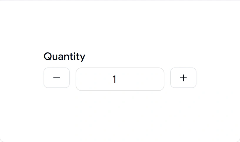
Number entry through the keyboard alone slows users down on small adjustments. This component adds increment and decrement buttons around the value so users can step quantities without typing. It keeps the value controlled, so your state always reflects what is on screen. Use it for any numeric field with frequent small changes.
Use cases:
- Quantity selectors in carts
- Stepper inputs for settings
- Guest or seat count forms
- Rating or score entry
- Numeric configuration fields
Best for: Quantity and stepper fields that need plus and minus controls.
Input with Add-ons
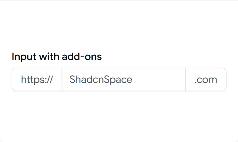
URL and domain fields often need a fixed prefix or suffix that should not be editable. This component places static text inside the field, like https:// or .com, so the user only types the variable part. The add-on stays visually attached without interfering with the value. Reach for it whenever part of the input is constant.
Use cases:
- Website and URL entry
- Username with a domain suffix
- Subdomain configuration
- Handle fields with an @ prefix
- Fixed-unit measurement inputs
Best for: URL and domain fields with a fixed prefix or suffix.
Input with Floating Label
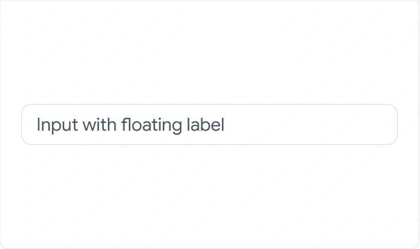
Forms with labels above every field eat vertical space fast in dense layouts. This component places the label inside the field, then animates it above on focus or when filled, saving space without hiding context. The motion is handled with Framer Motion for a clean transition. Use it in compact forms where space is tight, but labels still matter.
Use cases:
- Compact signup and login forms
- Modal and dialog forms
- Settings panels with many fields
- Mobile-first layouts
- Multi-step form steps
Best for: Compact forms that need labels without extra vertical space.
OTP Input
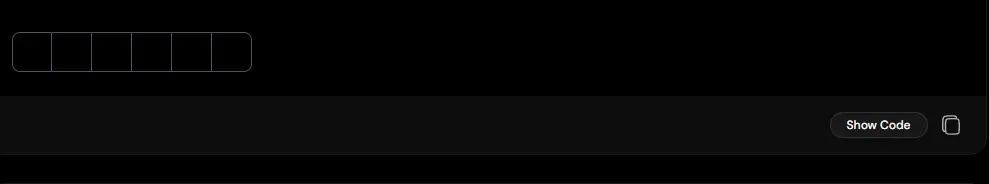
Entering verification codes in a standard text field can be frustrating and error-prone. This component provides dedicated input slots for one-time passwords, making code entry faster, clearer, and easier to validate. It helps users stay focused while reducing mistakes during authentication flows. Use it anywhere secure code verification is required.
Use cases:
- Two-factor authentication
- Phone number verification
- Email verification
- Account recovery
- Secure login flows
Best for: Entering verification codes with a streamlined and user-friendly experience.
Input with Clear Button
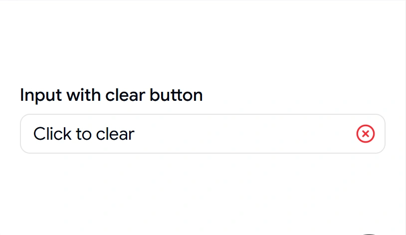
A search field with no quick clear forces users to select and delete manually. This component adds a clear button inside the field that wipes the value in one click and returns focus to the input. It only appears when there is something to clear, keeping the field tidy. Use it in any field where users edit and reset often.
Use cases:
- Search bars
- Filter inputs in dashboards
- Tag and query fields
- Resettable form fields
- Live-filter table search
Best for: Search and filter bars that need a one-click reset.
Input with End Inline Button
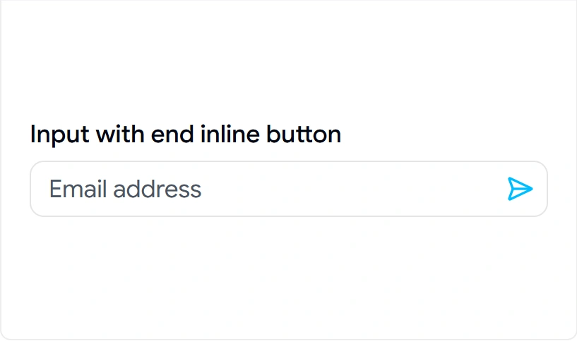
Pairing an input with a separate submit button often breaks alignment and spacing. This component sets the action button inside the field at the end, so the input and its action stay aligned as one control. It keeps focus and click targets sized correctly. Use it for short, single-action inputs where the button belongs with the field.
Use cases:
- Inline subscribe fields
- Copy-to-clipboard inputs
- Apply code or coupon fields
- Quick add inputs
- Inline confirm actions
Best for: Single-action inputs with an attached inline button.
Input with End Button
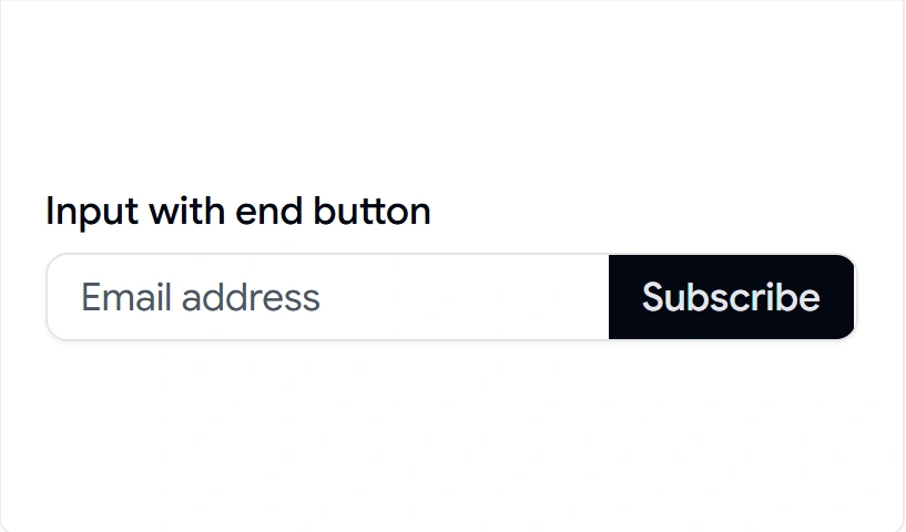
Newsletter and subscribe forms need a clear submit action right next to the field. This component attaches a full button at the end of the input, sized to match the field height, so the call to action reads as part of the input group. It keeps the layout stable across screen sizes. Use it when the field has one obvious next step.
Use cases:
- Newsletter signup forms
- Subscribe and join the inputs
- Search-and-go bars
- Send or submit fields
- Waitlist entry forms
Best for: Newsletter and subscribe forms with a clear submit button.
Input with File
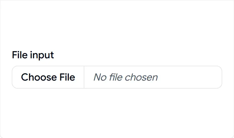
The native file input is one of the hardest elements to style consistently across browsers. This component gives you a styled file picker that matches your form while keeping native upload behavior underneath. It fits into forms without the default browser look breaking your layout. Use it anywhere users attach a file.
Use cases:
- Document and image uploads
- Profile picture selection
- Attachment fields in support forms
- Resume or CV submission
- Bulk import file pickers
Best for: Upload forms that need a styled file picker.
Input with Error
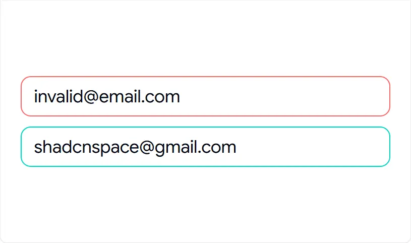
Error states added late tend to be inconsistent and hard to read for screen readers. This component ships with a built-in invalid state and message slot, so error styling and text stay consistent across every form. It wires the error to the field for accessible announcements. Use it wherever a field can fail validation.
Use cases:
- Form validation feedback
- Required-field errors
- Format mismatch messages
- Server-side error display
- Inline correction prompts
Best for: Form fields that need consistent, accessible error display.
Required Input
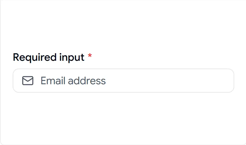
Required fields without a visible marker lead to skipped entries and submit failures. This component adds a required indicator and validation cue, so users see which fields they must complete before submitting. It keeps the marker consistent across the form. Use it on every mandatory field.
Use cases:
- Mandatory signup fields
- Required checkout details
- Account setup forms
- Compliance and consent inputs
- Key contact fields
Best for: Mandatory fields that need a clear required marker.
Standard Input
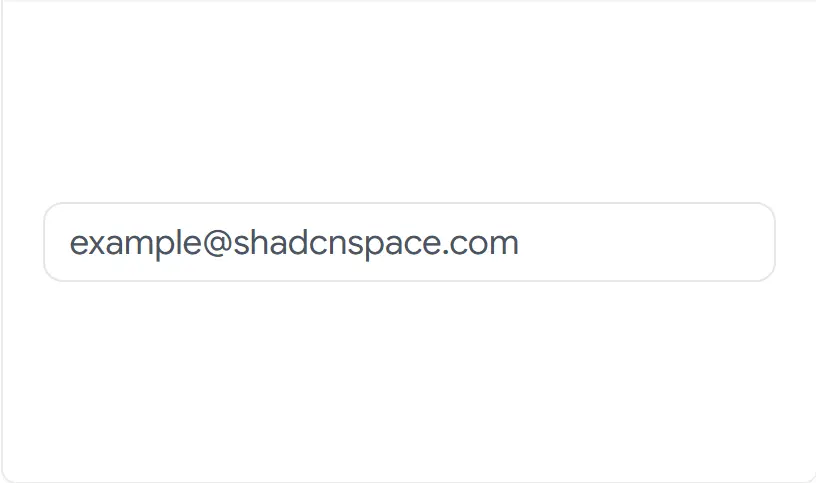
Sometimes you just need a clean baseline field that matches everything else. This component is the styled default with correct focus, spacing, and accessibility built in, ready to extend however you need. It gives you a consistent starting point instead of a bare native input. Use it as the foundation for most text entry.
Use cases:
- General text entry
- Name and title fields
- Single-line form inputs
- Search-free text fields
- Base for custom variants
Best for: General single-line text entry across your forms.
Textarea with Label
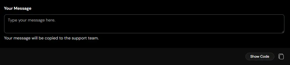
Without a clear context, users may hesitate or enter information in the wrong field. This component pairs a textarea with a descriptive label, making it immediately clear what information is expected. It improves form clarity, accessibility, and overall completion rates. Use it when longer inputs need clear guidance and structure.
Use cases:
- Contact forms
- Feedback collection
- Project requirements
- Support ticket details
- Survey responses
Best for: Multiline inputs that need clear labeling and context.
Input with Label
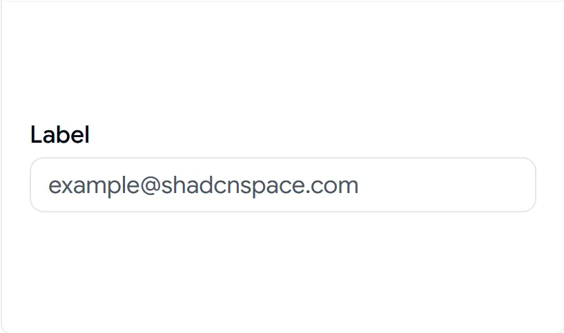
A field without a properly associated label is both a usability and accessibility problem. This component pairs a label with its input and wires them together, so clicks on the label focus the field and screen readers announce it correctly. It keeps label spacing consistent across the form. Use it as the default labeled field pattern.
Use cases:
- Standard labeled form fields
- Account and profile forms
- Settings and preferences
- Contact and address inputs
- Any accessible form field
Best for: Labeled form fields that need correct accessibility wiring.
Disabled
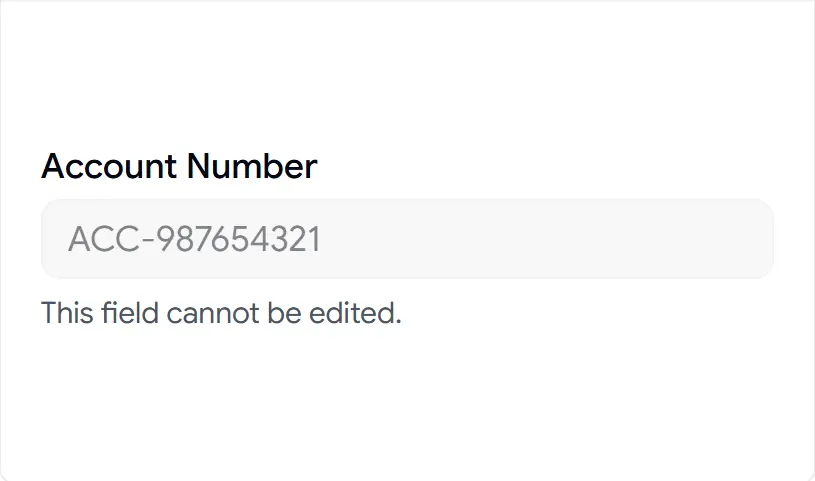
Read-only or locked fields often look identical to editable ones, which confuses users. This component gives you a clear disabled state with styling that signals the field cannot be edited, plus a helper line to explain why. It keeps the non-editable state consistent across the UI. Use it for values users can see but not change.
Use cases:
- Locked account fields
- Read-only system values
- Pre-filled, non-editable data
- Conditionally disabled inputs
- Display-only form fields
Best for: Read-only fields that should look clearly non-editable.
With Animated Checkmark
Valid input with no confirmation leaves users unsure they got it right. This component adds a Framer Motion checkmark that animates in when a field passes validation, giving immediate visual confirmation. It pairs well with live validation for username and password fields. Use it where positive feedback reduces hesitation.
Use cases:
- Username availability confirmation
- Password strength validation
- Verified email entry
- Step completion in multi-step forms
- Real-time success feedback
Best for: Fields that confirm a valid value with live visual feedback.
OTP Input Separator
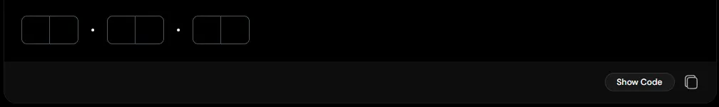
Long verification codes can be difficult to scan and enter correctly. This component adds visual separators between OTP input groups, improving readability and helping users process codes more easily. It creates a cleaner verification experience without adding complexity to the flow. Use it for authentication systems that benefit from grouped code entry.
Use cases:
- Multi-part verification codes
- Banking authentication flows
- Security confirmation steps
- Enterprise login systems
- Extended OTP formats
Best for: Grouped OTP inputs that need better visual organization and readability.
Easy Integration
These shadcn inputs sit in your project like any other component. No wrapper layers, no abstraction to fight.
- Combines with Button, Select, Checkbox, Tooltip, and Card without spacing or focus conflicts.
- Slots into React Hook Form with standard
register, controlandsetValuewiring. - Validates against Zod or Yup schemas out of the box for type-safe form handling.
- No hidden logic between you and the field. Extending a variant is a direct code edit.
FAQ’s
1. When should I use an input, textarea, or OTP component?
- Input: Use an input field for single-line text values such as names, email addresses, or search keywords. It’s lightweight and ideal for forms requiring brief user input.
- Textarea: A textarea is better suited for multi-line text entries like comments, descriptions, or other long-form input. It provides more space for the user and displays extended content effectively.
- OTP Component: Use an OTP (One-Time Password) component for secure, time-sensitive inputs like verification codes. It typically enforces input masks (e.g., numeric-only) and automatically handles transitions between There is no runtime dependency multiple fields for user convenience.
2. Should I use controlled or uncontrolled inputs?
Both work, and the right choice depends on the field. Use controlled inputs when you need to read or transform values live, such as currency formatting, character counters, and real-time validation. Use uncontrolled inputs for static forms where you only read values on submit, since they need less wiring. As a rule, anything with formatting or live feedback should be controlled.
3. Do these inputs work with Next.js App Router and server components?
Yes. The inputs are client components and run inside the App Router without extra setup. Mark the file with "use client" where you handle state and events, then use them like any client component inside server-rendered pages. Watch for hydration in fields with dynamic default values, and set the initial state consistently on the server and client to avoid mismatches.
Conclusion
Inputs look simple until you calculate the real cost. Each field requires validation, state management, and styling that your team rebuilds for every form. These components eliminate that duplicated work but keep you in full control of the code.
The biggest advantage is ownership. The CLI copies source code into your project, not a dependency. You get no runtime overhead, no version conflicts, and no black box when you need to make changes. You install it, then edit it.
These components offer the fastest path from a bare <input> to a production-ready form.
Once you have your inputs configured, the next step is often a date picker for scheduling or booking forms. You can find a guide to implementing a production-ready Shadcn date picker here.
For product tours or image galleries, a carousel component is often necessary. This tutorial for adding Shadcn carousels works well in e-commerce sites.
Finally, if you want a full list of available components before committing, our complete guide to Shadcn components offers a high-level overview of the entire ecosystem.