
Animations help developers explain UI state changes, guide user focus, and improve interaction clarity. Instead of writing complex animation logic from scratch, many teams now use animated UI component libraries built for React.
This guide reviews 6 React animation component libraries based on GitHub repositories, documentation, and real developer adoption.
We evaluated these libraries based on:
- GitHub stars and community adoption
- Number of components and animation patterns
- Tech stack compatibility with React ecosystems
- Update activity and repository maintenance
- Developer workflow (copy-paste vs package install)
All libraries in this list are open source and actively used in modern React projects.
What are Animated UI Component Libraries?
Animated UI component libraries are collections of prebuilt React components that include motion and interaction effects.
Instead of building animations manually with CSS or JavaScript, developers can reuse components like:
- Animated buttons
- Hover cards
- Animated backgrounds
- Loading states
- Hero section animations
Most modern libraries use Framer Motion or CSS animations and follow a copy-paste component model, allowing developers to edit the code directly in their project. This approach gives full control over styling and behavior.
Quick comparison of top React Animated UI Libraries
| Library | GitHub Stars | Approx Components | Best For |
| Shadcn Space | 455 | 195+ components | SaaS UI systems |
| Magic UI | 20.3K+ | 150+ components | Animated Landing Pages |
| React Bits | 36.5K+ | 110+ components | Creative UI Motion |
| Hero UI | 28.3K+ | 210+ components | Production React Apps |
| Kokonut UI | 1.8K+ | 100+ components | Startup Websites |
| Animate UI | 3.4K+ | 50+ components | Motion Interactions |
Core tech stack used by most libraries
Most React animation libraries use a similar modern frontend stack. Understanding this helps developers check framework compatibility and integration effort before choosing a library.
| Technology | Purpose in Animation Libraries | Why Developers Use It |
| React | Component architecture used by all libraries | Enables reusable UI components and state-driven rendering |
| Tailwind CSS | Utility-first styling system | Generates styles during build time and avoids runtime CSS overhead |
| TypeScript | Static typing and IDE support | Improves developer experience, autocomplete, and maintainability |
| Framer Motion | Animation engine for React | Handles physics-based animations, transitions, and gesture interactions |
Shadcn Space

Shadcn Space is part of the Shadcn ecosystem, offering reusable shadcn blocks and animated components. It follows a copy-paste architecture, encouraging developers to insert components directly into their codebase rather than installing heavy packages.
GitHub Stars: 455
Key Features:
- 195+ reusable UI components
- 250+ UI blocks for pages and sections
- Supports Radix and Base UI Primitives
- CLI support for component installation
- Figma Files Included
Common Use Cases:
- SaaS dashboards
- Admin panels
- Developer tools UI
- Analytics interfaces
Magic UI

Magic UI is an open-source animated component library focused on visually rich UI patterns. It includes effects such as animated beams, glowing borders, and dynamic backgrounds. The library allows developers to copy-paste components directly into their React or Next.js applications.
GitHub Stars: 20.3K+
Key Features:
- 150+ animation components
- CLI installation tool
- Animated hero sections
- Gradient and beam effects
- Minimal dependency structure
Common Use Cases:
- Startup landing pages
- Product marketing websites
- Developer portfolios
React Bits
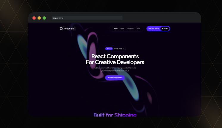
React Bits is one of the biggest animated React component collections in the open source world. The repository contains 110+ components, including UI elements, texts, and background animations. Developers can install components through the CLI or copy the source code directly into their projects.
GitHub Stars: 36.5K+
Key Features:
- 110+ animation components
- Minimal dependencies
- Background animation generators
- Four component variants (JS-CSS, JS-TW, TS-CSS, TS-TW)
- Tree-shakable components
Common Use Cases:
- Marketing websites
- Product showcases
- Creative UI interfaces
Hero UI
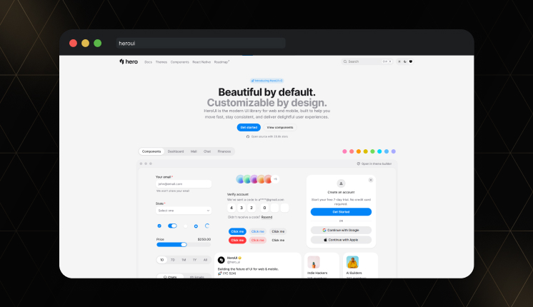
Hero UI (previously NextUI) is a complete React component system for scalable applications. It focuses on accessibility, theme customization, and production-ready components. It is a modern UI library designed to help teams move fast, stay consistent, and deliver better user experiences.
The library is built with Tailwind CSS and React Aria to offer accessible UI pattern components.
GitHub Stars:28.3K+
Key Features:
- 210+ production UI components
- Accessibility following WAI-ARIA guidelines
- Theme tokens and design system support
- Ability to override component tags
- Fully typed component APIs
Common Use Cases:
- SaaS applications
- Enterprise dashboards
- Admin panels
Kokonut UI

Kokonut UI is slightly different from most component libraries because it focuses on specific design styles and subtle UI animations. The UI components are designed to integrate with Tailwind-based design systems.
The library is often used by startups building product websites.
GitHub Stars:1.8K+
Key Features:
- 100+ UI components
- Lightweight architecture
- Reusable layout sections
- Simple animation utilities
Common Use Cases:
- SaaS landing pages
- Startup marketing sites
- Product pages
Animate UI
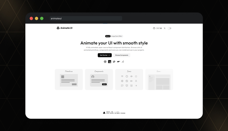
Animate UI provides motion-focused React components designed to add micro-interactions across interfaces. The library includes prebuilt animations for hover states, loading components, and UI transitions. A fully animated open-source component library built with React, TypeScript, Tailwind CSS, Framer Motion, and the Shadcn CLI.
GitHub Stars:3.4K+
Key Features:
- 50+ animated components
- Motion presets for UI states
- Reusable animation utilities
- Simple component integration
Common Use Cases:
- Onboarding flows
- Loading states
- UI micro-interactions
FAQ’s
1. Which React animation libraries support copy-paste components instead of installing packages?
Libraries such as Shadcn Space, React Bits, and Magic UI follow a copy-and-paste component model. Developers can copy the source code directly into their project instead of installing large UI packages.
2. Which animated UI library is best for SaaS dashboards?
Hero UI and Shadcn Space work well for SaaS dashboards because they provide structured UI components, including navigation, layouts, and widgets.
3. Do animation libraries affect React performance?
Most libraries rely on optimized tools like Framer Motion and Tailwind CSS. These frameworks minimize runtime styles and keep bundle sizes manageable when components are imported selectively.
Final Thoughts
Animations are most useful when they clearly explain what is happening in the interface. Small motion cues, such as hover feedback, loading transitions, or card interactions, can make UI states easier for users to understand.
The libraries in this list offer developers different options based on project scope. Some focus on visual landing page elements, while others provide structured components for full applications. Review the component coverage and the tech stack before integrating a component into your React project.
If you’re looking for pre-built, copy-paste libraries for components, blocks, and ready-to-use templates, check out this hand-picked guide to choosing the best Shadcn library for your project.